An anonymous reader of the blog emailed me:
–
I wonder if you’d be ok to help me to understanding this Gelman’s graph. I struggle to understand what is the plotted distribution and the exact meaning of the red area. Of course I read the related article, but it doesn’t help me much.
Rather than write a long-winded email, I figured it will be easier to explain on the blog using some step by step illustrations. With the anonymous reader’s permission I am sharing the question and this explanation for all to read. The graph in question is reproduced below. I will walk through my explanation by building up to this plot piecewise with the information we have about the specific situation referenced in the related paper. The paper, written by Andrew Gelman and John Carlin, illustrates the concepts of Type-M errors and Type-S errors. From the paper:
–
We frame our calculations not in terms of Type 1 and Type 2 errors but rather Type S (sign) and Type M (magnitude) errors, which relate to the probability that claims with confidence have the wrong sign or are far in magnitude from underlying effect sizes (p. 2)
So Gelman’s graph is an attempt to illustrate these types of errors. I won’t go into the details of the paper since you can read it yourself! I was asked to explain this graph though, which isn’t in the paper, so we’ll go through step by step building our own type-s/m graph in order to build an understanding. The key idea is this: if the underlying true population mean is small and sampling error is large, then experiments that achieve statistical significance must have exaggerated effect sizes and are likely to have the wrong sign. The graph in question:
–

–
A few technical details: Here Gelman is plotting a sampling distribution for a hypothetical experiment. If one were to repeatedly take a sample from a population, then each sample mean would be different from the true population mean by some amount due to random variation. When we run an experiment, we essentially pick a sample mean from this distribution at random. Picking at random, sample means tend to be near the true mean of the population, and the how much these random sample means vary follows a curve like this. The height of the curve represents the relative frequency for a sample mean in a series of random picks. Obtaining sample means far away from the true mean is relatively rare since the height of the curve is much lower the farther out we go from the population mean. The red shaded areas indicate values of sample means that achieve statistical significance (i.e., exceed some critical value).
–
The distribution’s form is determined by two parameters: a location parameter and a scale parameter. The location parameter is simply the mean of the distribution (μ), and the scale parameter is the standard deviation of the distribution (σ). In this graph, Gelman defines the true population mean to be 2 based on his experience in this research area; the standard deviation is equal to the sampling error (standard error) of our procedure, which in this case is approximately 8.1 (estimated from empirical data; for more information see the paper, p. 6). The extent of variation in sample means is determined by the amount of sampling error present in our experiment. If measurements are noisy, or if the sample is small, or both, then sampling error goes up. This is reflected in a wider sampling distribution. If we can refine our measurements, or increase our sample size, then sampling error goes down and we see a narrower sampling distribution (smaller value of σ).
Let’s build our own Type-S and Type-M graph
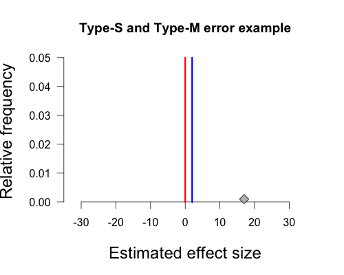
In Gelman’s graph the mean of the population is 2, and this is indicated by the vertical blue line at the peak of the curve. Again, this hypothetical true value is determined by Gelman’s experience with the topic area. The null hypothesis states that the true mean of the population is zero, and this is indicated by the red vertical line. The hypothetical sample mean from Gelman’s paper is 17, which I’ve added as a small grey diamond near the x-axis. R code to make all figures is provided at the end of this post (except the gif).
–

–
If we assume that the true population mean is actually zero (indicated by the red vertical line), instead of 2, then the sampling distribution has a location parameter of 0 and a scale parameter of 8.1. This distribution is shown below. The diamond representing our sample mean corresponds to a fairly low height on the curve, indicating that it is relatively rare to obtain such a result under this sampling distribution.
–

–
Next we need to define cutoffs for statistically significant effects (the red shaded areas under the curve in Gelman’s plot) using the null value combined with the sampling error of our procedure. Since this is a two-sided test using an alpha of 5%, we have one cutoff for significance at approximately -15.9 (i.e., 0 – [1.96 x 8.1]) and the other cutoff at approximately 15.9 (i.e., 0 + [1.96 x 8.1]). Under the null sampling distribution, the shaded areas are symmetrical. If we obtain a sample mean that lies beyond these cutoffs we declare our result statistically significant by conventional standards. As you can see, the diamond representing our sample mean of 17 is just beyond this cutoff and thus achieves statistical significance.
–

–
But Gelman’s graph assumes the population mean is actually 2, not zero. This is important because we can’t actually have a sign error or a magnitude error if there isn’t a true sign or magnitude. We can adjust the curve so that the peak is above 2 by shifting it over slightly to the right. The shaded areas begin in the same place on the x-axis as before (+/- 15.9), but notice that they have become asymmetrical. This is due to the fact that we shifted the entire distribution slightly to the right, shrinking the left shaded area and expanding the right shaded area.
–

–
And there we have our own beautiful type-s and type-m graph. Since the true population mean is small and positive, any sample mean falling in the left tail has the wrong sign and vastly overestimates the population mean (-15.9 vs. 2). Any sample mean falling in the right tail has the correct sign, but again vastly overestimates the population mean (15.9 vs. 2). Our sample mean falls squarely in the right shaded tail. Since the standard error of this procedure (8.1) is much larger than the true population mean (2), any statistically significant result must have a sample mean that is much larger in magnitude than the true population mean, and is quite likely to have the wrong sign.
–
In this case the left tail contains 24% of the total shaded area under the curve, so in repeated sampling a full 24% of significant results will be in the wrong tail (and thus be a sign error). If the true population mean were still positive but larger in magnitude then the shaded area in the left tail would become smaller and smaller, as it did when we shifted the true population mean from zero to 2, and thus sign errors would be less of a problem. As Gelman and Carlin summarize,
setting the true effect size to 2% and the standard error of measurement to 8.1%, the power comes out to 0.06, the Type S error probability is 24%, and the expected exaggeration factor is 9.7. Thus, it is quite likely that a study designed in this way would lead to an estimate that is in the wrong direction, and if “significant,” it is likely to be a huge overestimate of the pattern in the population. (p. 6)
I hope I’ve explained this clearly enough for you, anonymous reader (and other readers, of course). Leave a comment below or tweet/email me if anything is unclear!
–
Here is a neat gif showing our progression! Thanks for reading 🙂
–
(I don’t think this disclaimer is needed but here it goes: I don’t think people should actually use repeated-sampling statistical inference. This is simply an explanation of the concept. Be a Bayesian!)
R code
This file contains hidden or bidirectional Unicode text that may be interpreted or compiled differently than what appears below. To review, open the file in an editor that reveals hidden Unicode characters.
Learn more about bidirectional Unicode characters
| #The first plot with the null value and the proposed true value | |
| x <- seq(-35,35,.001) #set up for plotting the curve | |
| y <- dnorm(x,0,8.1) #y values for plotting curve | |
| plot(x=x,y=y, main="Type-S and Type-M error example", xlab="Estimated effect size", | |
| ylab="Relative frequency", type="l", cex.lab=1.5, axes=F, col="white") | |
| axis(1,at=seq(-30,30,10),pos=0) #make the axis nice | |
| axis(2,at=seq(0,.05,.01),pos=-35,las=1) #make the axis nice | |
| lines(c(0,0),c(0,.05),col="red",lwd=3) ##Add line at null value | |
| lines(c(2,2),c(0,.05),col="blue",lwd=3) ##Add line at population mean | |
| points(17, .001, pch=23, bg="grey",col="black",cex=1.5) ##Add sample mean | |
| ####################################################################################################### | |
| ##The second and third plots with the null sampling distribution and significance areas under the curve | |
| x <- seq(-35,35,.001) #set up for plotting the curve | |
| y <- dnorm(x,0,8.1) #y values for plotting curve | |
| plot(x,y, main="Type-S and Type-M error example", xlab="Estimated effect size", | |
| ylab= "Relative frequency", type="l",cex.lab=1.5, las=1, lwd=3, axes = F) | |
| axis(1,at=seq(-30,30,10),pos=0) #make the x axis nice | |
| axis(2,at=seq(0,.05,.01),pos=-35,las=1) #make the y axis nice | |
| lines(c(0,0),c(0,dnorm(0,0,8.1)),col="red",lwd=3) ##adds null line | |
| lines(c(2,2),c(0,dnorm(2,0,8.1)),col="blue",lwd=3) ##adds true pop mean line | |
| points(17, .001, pch=23, bg="grey",col="black",cex=1.5) ##adds sample mean | |
| ##Adds shaded area | |
| cord.x <- c(-35, seq(-35,-15.9,.01),-15.9) ##set up for shading | |
| cord.y <- c(0,dnorm(seq(-35,-15.9,.01),0,8.1),0) ##set up for shading | |
| polygon(cord.x,cord.y,col='red') ##shade left tail | |
| cord.xx <- c(35, seq(35,15.9,-.01),15.9) | |
| cord.yy <- c(0,dnorm(seq(35,15.9,-.01),0,8.1),0) | |
| polygon(cord.xx,cord.yy,col='red') ##shade right tail | |
| points(17, .001, pch=23, bg="grey",col="black",cex=1.5) ##replots the sample mean over the shading | |
| ####################################################################################################### | |
| ##The fourth plot with the alternative sampling distribution and significance areas under the curve | |
| x <- seq(-35,35,.001) #set up for plotting the curve | |
| y <- dnorm(x,2,8.1) #y values for plotting curve | |
| plot(x,y, main="Type-S and Type-M error example", xlab="Estimated effect size", | |
| ylab= "Relative frequency", type="l", cex.lab=1.5, las=1, lwd=3, axes = F) | |
| axis(1,at=seq(-30,30,10),pos=0) #make the x axis nice | |
| axis(2,at=seq(0,.05,.01),pos=-35, las=1) #make the y axis nice | |
| lines(c(0,0),c(0,dnorm(0,2,8.1)),col="red",lwd=3) ##add vertical line at null value | |
| lines(c(2,2),c(0,dnorm(2,2,8.1)),col="blue",lwd=3) ##add vertical line at population mean | |
| cord.x <- c(-35, seq(-35,-15.9,.01),-15.9) ##set up for shading | |
| cord.y <- c(0,dnorm(seq(-35,-15.9,.01),2,8.1),0) ##set up for shading | |
| polygon(cord.x,cord.y,col='red') ##shade left tail | |
| cord.xx <- c(35, seq(35,15.9,-.01),15.9) | |
| cord.yy <- c(0,dnorm(seq(35,15.9,-.01),2,8.1),0) | |
| polygon(cord.xx,cord.yy,col='red') ##shade right tail | |
| points(17, .001, pch=23, bg="grey",col="black", cex=1.5) ##replots sample mean over shading |

Nice working 🙂 This is my explanation regarding the problem: http://www.insight-things.com/power-statistical-tests
From my point of view you need to find a tradeoff between errors…
Here’s the code to do it with the tidyverse (ggplot2 + dplyr)
library(dplyr)
library(ggplot2)
dat %
mutate(x_right = x > 15.9,
x_left = x %
ggplot() +
geom_segment(x = 0, xend = 0, y = 0, yend = dnorm(0, 2, 8.1), color = ‘red’) +
geom_segment(x = 2, xend = 2, y = 0, yend = dnorm(2, 2, 8.1), color = ‘blue’) +
geom_area(data = dat %>%
filter(x_right),
aes(x = x, y = y),
fill = ‘red’) +
geom_area(data = dat %>%
filter(x_left),
aes(x = x, y = y),
fill = ‘red’) +
geom_line(aes(x, y), size = 0.7) +
geom_point(x = 17, y = 0) +
xlab(“Estimated effect size”) +
ylab(“Relative frequency”) +
theme_bw()
Something happened with the code in my previous comment and it was formatted incorrectly.
######################################################
library(dplyr)
library(ggplot2)
dat %
mutate(x_right = x > 15.9,
x_left = x %
ggplot() +
geom_segment(x = 0, xend = 0, y = 0, yend = dnorm(0, 2, 8.1), color = ‘red’) +
geom_segment(x = 2, xend = 2, y = 0, yend = dnorm(2, 2, 8.1), color = ‘blue’) +
geom_area(data = dat %>%
filter(x_right),
aes(x = x, y = y),
fill = ‘red’) +
geom_area(data = dat %>%
filter(x_left),
aes(x = x, y = y),
fill = ‘red’) +
geom_line(aes(x, y), size = 0.7) +
geom_point(x = 17, y = 0) +
xlab(“Estimated effect size”) +
ylab(“Relative frequency”) +
theme_bw()