Statistical paradoxes and omnibus tests

I’ve been thinking about statistical paradoxes lately. They crop up all over the place, and they make for fun little puzzles. In this blog I’ll talk about two paradoxes that can occur when doing omnibus statistical tests. Relevant code is attached as a gist at the bottom of the page.

1) A common paradox

There’s a pretty common –and annoying!– statistical phenomenon that most people are probably familiar with when testing whether multiple means are equal to each other (or to some specific value). It is not uncommon that one runs an overall omnibus test and obtains a significant result, allowing for rejection of the overall null hypothesis of equality. However, somewhat paradoxically(?), at the same time none of the followup tests on the individual group means/differences show a significant effect (even without multiplicity correction). So, with mild frustration, we can claim that there’s some difference among the groups but we cannot pinpoint where.

This “paradox” of course is totally understandable. The overall omnibus test looks at all the group deviations at once, so it is possible for the model’s overall deviation to be large enough that we can reject the omnibus null, even if none of the groups show a particularly large deviation themselves. In other words, small deviations among the groups add up to a “large” overall deviation. The most obvious case is the cross-over interaction, with subgroup means showing a1 – a2 > 0 and b1 – b2 < 0. Because they go in opposite directions, the difference between (a1-a2) and (b1-b2) can be large while neither individual difference is itself very large.

After some careful consideration, I’d bet most people come to see this kind of omnibus test behavior to be perfectly reasonable, and not actually a paradox.

But it is simple enough to simulate, so let’s do that and try to “see” the paradox.

Consider for simplicity testing only two group means, where the omnibus null hypothesis is that they are both equal to zero. Assume also for simplicity that the data from the two groups have known standard deviations, so that we can safely use z-values (rather than t-values). If the group means are independent, then to generate their sampling distribution we can simply generate pairs of z-values from standard normal distributions with mean zero and standard deviation one.

A large number of simulated pairs of z-values are shown below with dots. Because they are independent, the pairs scatter around the origin (0,0) in all directions equally, with most pairs relatively close to the origin (the red cross).

rzero

Any pair of observable z-values lives somewhere on this plane, with their address given by their coordinates (z1, z2). A natural discrepancy measure in this scenario between the observed pair and the null hypothesis is the distance from the origin to the pair. This is merely the length of the line connecting (0,0) to the point (z1, z2) — i.e., Euclidean distance — which is the hypotenuse of a right triangle with base z1 and height z2. The Pythagorean theorem tells us this length is given by D=√(z1² + z2²).  Hence, we would reject the omnibus null only if the observed pair of z-values lives “far enough” away from the middle point of this cloud.

For example, the arrow starts at the origin and points to the pair (1.75, 1.85). The length of this arrow is √(1.75² + 1.85²) ≈ 2.55, i.e. the Euclidean distance from the null hypothesis (0,0) to the point (1.75, 1.85) is about 2.55.

If we call the sum of two squared independent z-values D² (i.e., the squared length from the origin to the pair), this D²-value follows a chi-square distribution with two degrees of freedom (with n tests it has df=n). The omnibus test is then significant only if D² is larger than the 95th percentile of the reference chi-square distribution, which is the value 5.991 for df=2. This region is shown with the circle. Observing any pairs of z-values inside the circle does not lead to rejection of the omnibus null, whereas observing pairs located outside the circle does lead to rejection. As we would expect, about 95% of the simulated pairs live inside the circle, and 5% live outside the circle.

The squared distance from the origin to the pair (1.75, 1.85) is 2.55², or roughly 6.45. This D² is larger than the critical value 5.991, so the pair (1.75, 1.85) would lead us to reject the overall null that both means are zero.

The grey square marks the area where neither individual test would reject its null, so z-pairs outside the box would result in at least one of the individual nulls being rejected. If we only looked at the z1 coordinate, we would reject the null for that test when z1 falls outside the vertical lines, and the same goes for z2 and the horizontal lines. The pair (1.75, 1.85) would therefore not lead to rejection of either test’s individual null hypothesis because it lives inside the box.

Thus, the zone where this “paradox” occurs is anywhere we can observe a pair of z-values that falls outside the circle but inside the box. That is, the paradox occurs in the four inside corners of the grey box. In this case with two groups, that area is quite small — it happens about .25% of the time if the omnibus null is true.

Fun little side result: As you increase the number of independent tests, so not just two tests but n -> infinity tests, the probability of observing all z-values in this “paradox” zone actually approaches 0%. Heuristically, we’d expect that with enough tests, at least one of them will eventually, by chance, get a z-value bigger than 1.96.

The proof is pretty easy. Consider that for any number of tests n the paradox zone is a subset of the inner box (i.e., the “n-cube” in n dimensions) that has sides of length 2*1.96. Then, the probability this paradox occurs is bounded from above by the probability that all n individual z-values are less than 1.96 in absolute value (i.e., that they live inside the n-cube). That probability is .95n when the omnibus null is true, which clearly goes to zero as n increases. Of course, that probability is just an upper bound; the actual probability of the paradox zone can get really small really fast!

2) Rao’s little-known paradox

There is another paradox that can occur when doing omnibus tests, which is less widely known. But I think this one is much harder to resolve, even with drawing a picture! Rao’s paradox is basically the opposite of the previous paradox: The omnibus test of the overall null is non-significant, meaning we cannot reject the null hypothesis that all groups have zero mean (or equal means, etc.). But at the same time, all individual tests show a significant effect, so we can reject each group’s individual null hypothesis.

Kinda freaky right? (Maybe I should have posted this blog on halloween!…)

Rao’s paradox can occur when your tests are not independent. Imagine that you have participants come into the lab and you give them multiple tasks that measure the same general construct. Then it is not inconceivable that people high on the construct tend to score high on both tasks, and people low on the construct tend to score low on both tasks. This would naturally induce a positive correlation between the two sets of scores, and thus between their test statistics. Rao’s paradox could then occur, where you reject the null using task 1, reject the null using task 2, but fail to reject the joint null using an omnibus test.

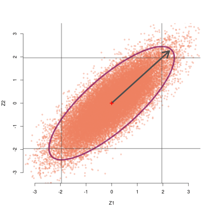
Consider again the case of two testing two group means, but now assume the two z-values are correlated at r=.5. Now we can generate pairs of z-values from a bivariate normal distribution with means of zero, standard deviations of 1, but correlation of .5. The sampling distribution of these correlated pairs of z-values is shown below. Compared to the previous example, this sampling distribution is sort of slanted and elongated at the upper-right and lower-left corners due to the correlation. I’ve also extended the edges of the grey box out a little bit for a reason that will make sense soon.

rfive

In this case the omnibus null hypothesis is rejected whenever a pair of z-values falls outside the ellipse.  Our test statistic is still a function of the distance between the pair of z-values and the origin, but now we also need to know which direction the z-pair lies in relation to the general orientation of the sampling distribution. Clearly, some pairs of z-values that are close to the origin live outside the ellipse (northwest and southeast directions) and some that are far away live inside the ellipse (northeast and southwest directions).

Instead of the squared Euclidean distance that we used last time, now we will use the squared Mahalanobis distance as our test statistic. The Mahalanobis distance is essentially a generalization of Euclidean distance, to account for the direction and scale of the sampling distribution. In the case of two correlated z-tests, the squared Mahalanobis distance is D² = (1-r²)-1(z1² – 2rz1z2 + z2²), which once again follows a chi-square distribution with 2 degrees of freedom. So once again we reject the omnibus null if D² is larger than 5.991.

Take for example the observe pair (2.05, 2.05). When r=.5, this pair achieves a Mahalanobis distance of D² = 5.60, which is not larger than 5.99 and hence not significant. Thus, we would not reject the omnibus null. However, both z-values alone would normally be considered significant (two-tailed p = .04) and we would reject each individual null hypothesis.

From the picture, we see that any pair that lands outside the inner square, but inside the ellipse, will lead to this paradox occurring. That is, the upper right or lower left outside corners of the box.

As the correlation between tests gets larger, the sampling distribution gets stretched farther and farther in the diagonal direction. Thus, as r gets bigger we can observe larger and larger pairs of z-values (up to a limit) without rejecting the omnibus null. For instance, the sampling distribution for r=.8 is shown below. Even observing the pair (2.25, 2.25) would not reject the omnibus null, despite each individual test obtaining p=.024.

reight

To recap: Rao’s paradox can happen when you have correlated test statistics, which actually can happen a lot. For example, consider a simple linear regression with an intercept and slope parameter. If you do not center your predictor then your sampling distribution of the intercept and slope will very likely be correlated, possibly quite highly!

Are there other cool paradoxes?

If you read this far and know of other statistical “paradoxes” that can happen with omnibus tests I’d love to hear about them (via a comment, twitter, etc.). Also let me know if you would like to see more blogs about other statistical paradoxes, not necessarily just ones related to omnibus tests but just other interesting paradoxes in general. They are pretty fun little puzzles!


Code for the figures:


library(MASS)
library(ellipse)
#Helper function to make colors more transluscent
add.alpha <- function(col, alpha=1){#from https://www.r-bloggers.com/how-to-change-the-alpha-value-of-colours-in-r/
if(missing(col))
stop("Please provide a vector of colours.")
apply(sapply(col, col2rgb)/255, 2,
function(x)
rgb(x[1], x[2], x[3], alpha=alpha))
}
#Colors I like
salmon <- add.alpha("salmon2",.35)
maroon <- add.alpha("maroon4",.8)
Grey <- add.alpha("grey20",.4)
#Helper function to compute mahalanobis dist. for vector v & matrix A
#Reduces to Euclidean dist. when A is proportional to an identity matrix
quad.form <- function(v,A){
Q <- v%*%A%*%v
return(Q)
}
#Now we can do our simulation
set.seed(1337)
r <- 0 #correlation between tests, 0=indep.
k <- 3e4 #replicates
n <- 2 #number of tests
test.z <- c(1.75,1.85) #example z values for r=0
#test.z <- c(2.05, 2.05) #example z values for r=.5
#test.z <- c(2.25,2.25) #example z values for r=.8
mu <- rep(0,n) #Mean vector
sigma <- diag(1-r,n)+ matrix(rep(r,n^2),n,n) #Covariance matrix
tau <- solve(sigma) #Invert cov. matrix
#tau <- 1/(1-r^2)*matrix(c(1,-r,-r,1),nrow=2) #Precise tau for 2 Z tests
Z <- mvrnorm(k,mu,sigma) # generate our z-values
D2 <- apply(Z,1,quad.form,A=tau) # compute our omnibus test statistic
crit <- qchisq(.95,df=n) # critical value of chi-square
#Plot the sampling distribution and add ellipse/circle and box and arrow
plot(Z[,1],Z[,2],xlim=c(-3.2,3.2),ylim=c(-3.2,3.2),col=salmon,pch=20,bty="n",xlab="Z1",ylab="Z2")
lines(ellipse(sigma,level=.95),col=maroon,lwd=5,lty=1)
lines(c(-1.96,-1.96,-1.96,1.96,1.96,1.96,1.96,-1.96),
c(-1.96,1.96,1.96,1.96,1.96,-1.96,-1.96,-1.96),lwd=3,col=Grey)
#abline(v=c(-1.96,1.96),col=Grey,lwd=3) #Extend the lines of the box
#abline(h=c(-1.96,1.96),col=Grey,lwd=3) #Extend the lines of the box
arrows(0,0,test.z[1],test.z[2],col="grey30",lwd=5)
points(0,0,pch=3,col="red",lwd=3)

view raw

OmnibusParadox

hosted with ❤ by GitHub

My friends did some cool science in 2018

I’ve had a bit of blogger’s block lately (read: the last two years). I have a tendency to write half of a blog post and then scrap it because I don’t think it’s that interesting. Well, my goal this year is to get over it. So to start I decided I want to highlight some of the very cool science my friends did in 2018. Honestly I feel like I don’t do enough to lift up my friends and celebrate their accomplishments, so here are three examples of papers my friends wrote last year that sparked a change in the way I think about one topic or another. I should say, if you aren’t keeping up with these early career researchers, you’re simply missing out on some great science. Happy 2019, everyone!

Improving psychological theory-testing via “systems of orders”

My friend Julia Haaf has been killing it lately (follow her on twitter and check out her google scholar). She just finished her PhD at Missouri and took up a really cool postdoc at the University of Amsterdam, and it feels like every other month she is posting a preprint to some awesome new paper.  One of her papers I’d like to highlight is titled “A note on using systems of orders to capture theoretical constraint in psychological science” (co-authored with Fayette Klaassen and Jeff Rouder), which she presented at APS 2018 in our invited symposium, “Bayesian methods for the pragmatic psychologist.”

This paper really blew me away. One common theme in the ongoing reproducibility debate in psychology is that we need to improve the theory development of our field. The fact is, as psychologists we tend to describe our theories as a set of ordered relationships; e.g., that men respond slower than women in condition A but not condition B. I’m not sure if that will ever change. But when we go to test these directional theories, we usually do something super simple to account for our directional prediction, like a one-sided t-test. Julia and her coauthors describe this process as intellectually inefficient,  because “by positing [a] coarse verbal theory that provides for only modest constraints on the data, we are neither risking nor learning much from the data.” We can do better.

The paper goes on to present a framework that allows us to represent these types of theoretical predictions as sets of explicit order constraints between parameters in a statistical model. Moreover, they demonstrate with nice examples how a Bayesian approach to comparing competing psychological models allows for richer tests of theories in psychology. And come on, just look at this figure. It’s awesome.

haaf_fig

Should we go to the LOO for model selection?

Another person killing it lately is my friend Quentin Gronau (he isn’t on twitter but check out his google scholar page full of interesting work!). Quentin is doing his PhD at the University of Amsterdam, and he blogs at http://www.bayesianspectacles.org from time to time. He and I are at the same stage of our PhD (third year) and we have a lot of overlapping research interests, so I’m always eager to read any paper he writes. One of Quentin’s papers that came out last year that I found quite thought-provoking was titled “Limitations of Bayesian Leave-One-Out Cross-Validation for Model Selection” (co-authored with E.-J. Wagenmakers).

The main idea of this paper is to examine, in the simplest cases possible, the behavior of the Bayesian version of leave-one-out cross-validation (i.e., LOO) when used as a model comparison tool. It turns out that LOO does some weird stuff. For instance, consider comparing models of random guessing vs. informed responding (e.g., H0: θ=.5 vs. H1: θ≠.5) in some binary choice scenario. If we are in a situation where data come in pairs, and if it happens that every pair has 1 success and 1 failure, then we would ideally want our model comparison tool to give more and more evidence for the guessing model as pairs continue to come in. A split pair is, after all, perfectly in line with what the guessing model would predict will happen. If you use LOO for this model comparison, however, the evidence in favor of the guessing model can cap out at a relatively low amount even with observing an infinite number of success-fail pairs.

Also, look at these pretty figures. So damn clean.

The conclusion of this paper was, basically, be careful of LOO if you use it as model comparison tool; if it does weird stuff in super simple cases then how can we be confident it’s doing something sensible in more complex cases? (The paper is more nuanced of course). This paper created quite a stir among some Bayesian circles, and prompted the journal that published it, Computational Brain and Behavior, to invite some very prominent researchers to write commentaries, which I also found quite thought-provoking (find them here, here, and here, and a rejoinder here).  All in all, this paper and the commentaries made me think deeply about model comparison tools and what we should expect from them.

Correlation, causation, and DAGs, oh my!

Another person I want to include in this post is my other friend named Julia: Julia Rohrer (you’ll follow her on twitter and on google scholar if you know what’s good for you). (Both Julias also happen to be German! Julia was apparently the 36th most popular women’s name in Germany in 2017. Wait, Quentin is German too. Wow, the education system over there must be doing something right.)  Julia R. is also in her third year of her PhD –holla!– at the Max Planck Institute for the Life Course in Leipzig, where she is studying personality psychology. ALSO she is simultaneously(!) doing an undergraduate degree in computer science. Last year Julia published what I think is one of the best introductory tutorials out there on causal modeling, titled “Thinking clearly about correlations and causation: Graphical causal models for observational data.”

I think this paper should be required reading for anyone who wants to make causal statements but is limited to collecting observational data. A big challenge when working with observational data is that you can’t rule out confounding factors using randomization like you could in a controlled experiment. This paper outlines a way to model the relationships between variables of interest using what are called “Directed Acyclic Graphs” (i.e., DAGs) to get at the causal inferences we want to make in observational studies. If we create a set of boxes representing variables of interest and arrows that connect them, then if we follow certain rules, voilà, we have ourselves a DAG and maybe a chance at inferring causation. (There’s a bit more to it than just that, of course).

All the figures in this paper are box and arrow causal plots, so I’ll spare you copying them here. Instead I will share some section headers from this paper that I really enjoyed:

  • Confounding: The Bane of Observational Data
  • Learning to Let Go: When Statistical Control Hurts
  • Conclusion: Making Causal Inferences on the Basis of Correlational Data Is Very Hard

What more can I say? Go read these papers right now! You’ll be glad you did!

Understanding Bayes: Visualization of the Bayes Factor

In the first post of the Understanding Bayes series I said:

The likelihood is the workhorse of Bayesian inference. In order to understand Bayesian parameter estimation you need to understand the likelihood. In order to understand Bayesian model comparison (Bayes factors) you need to understand the likelihood and likelihood ratios.

I’ve shown in another post how the likelihood works as the updating factor for turning priors into posteriors for parameter estimation. In this post I’ll explain how using Bayes factors for model comparison can be conceptualized as a simple extension of likelihood ratios.

There’s that coin again

Imagine we’re in a similar situation as before: I’ve flipped a coin 100 times and it came up 60 heads and 40 tails. The likelihood function for binomial data in general is:

\ P \big(X = x \big) \propto \ p^x \big(1-p \big)^{n-x}

and for this particular result:

\ P \big(X = 60 \big) \propto \ p^{60} \big(1-p \big)^{40}

The corresponding likelihood curve is shown below, which displays the relative likelihood for all possible simple (point) hypotheses given this data. Any likelihood ratio can be calculated by simply taking the ratio of the different hypotheses’s heights on the curve.

fig1

In that previous post I compared the fair coin hypothesis — H0: P(H)=.5 — vs one particular trick coin hypothesis — H1: P(H)=.75. For 60 heads out of 100 tosses, the likelihood ratio for these hypotheses is L(.5)/L(.75) = 29.9. This means the data are 29.9 times as probable under the fair coin hypothesis than this particular trick coin hypothesisBut often we don’t have theories precise enough to make point predictions about parameters, at least not in psychology. So it’s often helpful if we can assign a range of plausible values for parameters as dictated by our theories.

Enter the Bayes factor

Calculating a Bayes factor is a simple extension of this process. A Bayes factor is a weighted average likelihood ratio, where the weights are based on the prior distribution specified for the hypotheses. For this example I’ll keep the simple fair coin hypothesis as the null hypothesis — H0: P(H)=.5 — but now the alternative hypothesis will become a composite hypothesis — H1: P(θ). (footnote 1) The likelihood ratio is evaluated at each point of P(θ) and weighted by the relative plausibility we assign that value. Then once we’ve assigned weights to each ratio we just take the average to get the Bayes factor. Figuring out how the weights should be assigned (the prior) is the tricky part.

Imagine my composite hypothesis, P(θ), is a combination of 21 different point hypotheses, all evenly spaced out between 0 and 1 and all of these points are weighted equally (not a very realistic hypothesis!). So we end up with P(θ) = {0, .05, .10, .15, . . ., .9, .95, 1}. The likelihood ratio can be evaluated at every possible point hypothesis relative to H0, and we need to decide how to assign weights. This is easy for this P(θ); we assign zero weight for every likelihood ratio that is not associated with one of the point hypotheses contained in P(θ), and we assign weights of 1 to all likelihood ratios associated with the 21 points in P(θ).

This gif has the 21 point hypotheses of P(θ) represented as blue vertical lines (indicating where we put our weights of 1), and the turquoise tracking lines represent the likelihood ratio being calculated at every possible point relative to H0: P(H)=.5. (Remember, the likelihood ratio is the ratio of the heights on the curve.) This means we only care about the ratios given by the tracking lines when the dot attached to the moving arm aligns with the vertical P(θ) lines. [edit: this paragraph added as clarification]
gif11

The 21 likelihood ratios associated with P(θ) are:

{~0, ~0, ~0, ~0, ~0, ~0, ~0, ~0, .002, .08, 1, 4.5, 7.5, 4.4, .78, .03, ~0, ~0, ~0, ~0, ~0}

Since they are all weighted equally we simply average, and obtain BF = 18.3/21 = .87. In other words, the data (60 heads out of 100) are 1/.87 = 1.15 times more probable under the null hypothesis — H0: P(H)=.5 — than this particular composite hypothesis — H1: P(θ). Entirely uninformative! Despite tossing the coin 100 times we have extremely weak evidence that is hardly worth even acknowledging. This happened because much of P(θ) falls in areas of extremely low likelihood relative to H0, as evidenced by those 13 zeros above. P(θ) is flexible, since it covers the entire possible range of θ, but this flexibility comes at a price. You have to pay for all of those zeros with a lower weighted average and a smaller Bayes factor.

Now imagine I had seen a trick coin like this before, and I know it had a slight bias towards landing heads. I can use this information to make more pointed predictions. Let’s say I define P(θ) as 21 equally weighted point hypotheses again, but this time they are all equally spaced between .5 and .75, which happens to be the highest density region of the likelihood curve (how fortuitous!). Now P(θ) = {.50, .5125, .525, . . ., .7375, .75}.
gif22

The 21 likelihood ratios associated with the new P(θ) are:

{1.00, 1.5, 2.1, 2.8, 4.5, 5.4, 6.2, 6.9, 7.5, 7.3, 6.9, 6.2, 4.4, 3.4, 2.6, 1.8, .78, .47, .27, .14, .03}

They are all still weighted equally, so the simple average is BF = 72/21 = 3.4. Three times more informative than before, and in favor of P(θ) this time! And no zeros. We were able to add theoretically relevant information to H1 to make more accurate predictions, and we get rewarded with a Bayes boost. (But this result is only 3-to-1 evidence, which is still fairly weak.)

This new P(θ) is risky though, because if the data show a bias towards tails or a more extreme bias towards heads then it faces a very heavy penalty (many more zeros). High risk = high reward with the Bayes factor. Make pointed predictions that match the data and get a bump to your BF, but if you’re wrong then pay a steep price. For example, if the data were 60 tails instead of 60 heads the BF would be 10-to-1 against P(θ) rather than 3-to-1 for P(θ)!

Now, typically people don’t actually specify hypotheses like these. Typically they use continuous distributions, but the idea is the same. Take the likelihood ratio at each point relative to H0, weigh according to plausibilities given in P(θ), and then average.

A more realistic (?) example

Imagine you’re walking down the sidewalk and you see a shiny piece of foreign currency by your feet. You pick it up and want to know if it’s a fair coin or an unfair coin. As a Bayesian you have to be precise about what you mean by fair and unfair. Fair is typically pretty straightforward — H0: P(H)=.5 as before — but unfair could mean anything. Since this is a completely foreign coin to you, you may want to be fairly open-minded about it. After careful deliberation, you assign P(θ) a beta distribution, with shape parameters 10 and 10. That is, H1: P(θ) ~ Beta(10, 10). This means that if the coin isn’t fair, it’s probably close to fair but it could reasonably be moderately biased, and you have no reason to think it is particularly biased to one side or the other.

prior1010

Now you build a perfect coin-tosser machine and set it to toss 100 times (but not any more than that because you haven’t got all day). You carefully record the results and the coin comes up 33 heads out of 100 tosses. Under which hypothesis are these data more probable, H0 or H1? In other words, which hypothesis did the better job predicting these data?

This may be a continuous prior but the concept is exactly the same as before: weigh the various likelihood ratios based on the prior plausibility assignment and then average. The continuous distribution on P(θ) can be thought of as a set of many many point hypotheses spaced very very close together. So if the range of θ we are interested in is limited to 0 to 1, as with binomials and coin flips, then a distribution containing 101 point hypotheses spaced .01 apart, can effectively be treated as if it were continuous. The numbers will be a little off but all in all it’s usually pretty close. So imagine that instead of 21 hypotheses you have 101, and their relative plausibilities follow the shape of a Beta(10, 10). (footnote 2)

gif33

Since this is not a uniform distribution, we need to assign varying weights to each likelihood ratio. Each likelihood ratio associated with a point in P(θ) is simply multiplied by the respective density assigned to it under P(θ). For example, the density of P(θ) at .4 is 2.44. So we multiply the likelihood ratio at that point, L(.4)/L(.5) = 128, by 2.44, and add it to the accumulating total likelihood ratio. Do this for every point and then divide by the total number of points, in this case 101, to obtain the approximate Bayes factor. The total weighted likelihood ratio is 5564.9, divide it by 101 to get 55.1, and there’s the Bayes factor. In other words, the data are roughly 55 times more probable under this composite H1 than under H0. The alternative hypothesis H1 did a much better job predicting these data than did the null hypothesis H0.

The actual Bayes factor is obtained by integrating the likelihood with respect to H1’s density distribution and then dividing by the (marginal) likelihood of H0. Essentially what it does is cut P(θ) into slices infinitely thin before it calculates the likelihood ratios, re-weighs, and averages. That Bayes factor comes out to 55.7, which is basically the same thing we got through this ghetto visualization demonstration!

Take home

The take-home message is hopefully pretty clear at this point: When you are comparing a point null hypothesis with a composite hypothesis, the Bayes factor can be thought of as a weighted average of every point hypothesis’s likelihood ratio against H0, and the weights are determined by the prior density distribution of H1. Since the Bayes factor is a weighted average based on the prior distribution, it’s really important to think hard about the prior distribution you choose for H1. In a previous post, I showed how different priors can converge to the same posterior with enough data. The priors are often said to “wash out” in estimation problems like that. This is not necessarily the case for Bayes factors. The priors you choose matter, so think hard!

Notes

Footnote 1: A lot of ink has been spilled arguing about how one should define P(θ). I talked about it a little a previous post.

Footnote 2: I’ve rescaled the likelihood curve to match the scale of the prior density under H1. This doesn’t affect the values of the Bayes factor or likelihood ratios because the scaling constant cancels itself out.

R code

## Plots the likelihood function for the data obtained
## h = number of successes (heads), n = number of trials (flips),
## p1 = prob of success (head) on H1, p2 = prob of success (head) on H0
#the auto plot loop is taken from http://www.r-bloggers.com/automatically-save-your-plots-to-a-folder/
#and then the pngs are combined into a gif online
LR <- function(h,n,p1=seq(0,1,.01),p2=rep(.5,101)){
L1 <- dbinom(h,n,p1)/dbinom(h,n,h/n) ## Likelihood for p1, standardized vs the MLE
L2 <- dbinom(h,n,p2)/dbinom(h,n,h/n) ## Likelihood for p2, standardized vs the MLE
Ratio <<- dbinom(h,n,p1)/dbinom(h,n,p2) ## Likelihood ratio for p1 vs p2, saves to global workspace with <<-
x<- seq(0,1,.01) #sets up for loop
m<- seq(0,1,.01) #sets up for p(theta)
ym<-dbeta(m,10,10) #p(theta) densities
names<-seq(1,length(x),1) #names for png loop
for(i in 1:length(x)){
mypath<-file.path("~","Dropbox","Blog Drafts","bfs","figs1",paste("myplot_", names[i], ".png", sep = "")) #set up for save file path
png(file=mypath, width=1200,height=1000,res=200) #the next plotted item saves as this png format
curve(3.5*(dbinom(h,n,x)/max(dbinom(h,n,h/n))), ylim=c(0,3.5), xlim = c(0,1), ylab = "Likelihood",
xlab = "Probability of heads",las=1, main = "Likelihood function for coin flips", lwd = 3)
lines(m,ym, type="h", lwd=1, lty=2, col="skyblue" ) #p(theta) density
points(p1[i], 3.5*L1[i], cex = 2, pch = 21, bg = "cyan") #tracking dot
points(p2, 3.5*L2, cex = 2, pch = 21, bg = "cyan") #stationary null dot
#abline(v = h/n, lty = 5, lwd = 1, col = "grey73") #un-hash if you want to add a line at the MLE
lines(c(p1[i], p1[i]), c(3.5*L1[i], 3.6), lwd = 3, lty = 2, col = "cyan") #adds vertical line at p1
lines(c(p2[i], p2[i]), c(3.5*L2[i], 3.6), lwd = 3, lty = 2, col = "cyan") #adds vertical line at p2, fixed at null
lines(c(p1[i], p2[i]), c(3.6, 3.6), lwd=3,lty=2,col="cyan") #adds horizontal line connecting them
dev.off() #lets you save directly
}
}
LR(33,100) #executes the final example
v<-seq(0,1,.05) #the segments of P(theta) when it is uniform
sum(Ratio[v]) #total weighted likelihood ratio
mean(Ratio[v]) #average weighted likelihood ratio (i.e., BF)
x<- seq(0,1,.01) #segments for p(theta)~beta
y<-dbeta(x,10,10) #assigns densitys for P(theta)
k=sum(y*Ratio) #multiply likelihood ratios by the density under P(theta)
l=k/101 #weighted average likelihood ratio (i.e., BF)
view raw BF_visuals.R hosted with ❤ by GitHub

Type-S and Type-M errors

An anonymous reader of the blog emailed me:
 –
I wonder if you’d be ok to help me to understanding this Gelman’s  graphI struggle to understand what is the plotted distribution and the exact meaning of the red area. Of course I read the related article, but it doesn’t help me much.
Rather than write a long-winded email, I figured it will be easier to explain on the blog using some step by step illustrations. With the anonymous reader’s permission I am sharing the question and this explanation for all to read. The graph in question is reproduced below. I will walk through my explanation by building up to this plot piecewise with the information we have about the specific situation referenced in the related paper. The paper, written by Andrew Gelman and John Carlin, illustrates the concepts of Type-M errors and Type-S errors. From the paper:
We frame our calculations not in terms of Type 1 and Type 2 errors but rather Type S (sign) and Type M (magnitude) errors, which relate to the probability that claims with confidence have the wrong sign or are far in magnitude from underlying effect sizes (p. 2)
So Gelman’s graph is an attempt to illustrate these types of errors. I won’t go into the details of the paper since you can read it yourself! I was asked to explain this graph though, which isn’t in the paper, so we’ll go through step by step building our own type-s/m graph in order to build an understanding. The key idea is this: if the underlying true population mean is small and sampling error is large, then experiments that achieve statistical significance must have exaggerated effect sizes and are likely to have the wrong sign. The graph in question:
gelmanPlot
A few technical details: Here Gelman is plotting a sampling distribution for a hypothetical experiment. If one were to repeatedly take a sample from a population, then each sample mean would be different from the true population mean by some amount due to random variation. When we run an experiment, we essentially pick a sample mean from this distribution at random. Picking at random, sample means tend to be near the true mean of the population, and the how much these random sample means vary follows a curve like this. The height of the curve represents the relative frequency for a sample mean in a series of random picks. Obtaining sample means far away from the true mean is relatively rare since the height of the curve is much lower the farther out we go from the population mean. The red shaded areas indicate values of sample means that achieve statistical significance (i.e., exceed some critical value).
 –
The distribution’s form is determined by two parameters: a location parameter and a scale parameter. The location parameter is simply the mean of the distribution (μ), and the scale parameter is the standard deviation of the distribution (σ). In this graph, Gelman defines the true population mean to be 2 based on his experience in this research area; the standard deviation is equal to the sampling error (standard error) of our procedure, which in this case is approximately 8.1 (estimated from empirical data; for more information see the paper, p. 6). The extent of variation in sample means is determined by the amount of sampling error present in our experiment. If measurements are noisy, or if the sample is small, or both, then sampling error goes up. This is reflected in a wider sampling distribution. If we can refine our measurements, or increase our sample size, then sampling error goes down and we see a narrower sampling distribution (smaller value of σ).

Let’s build our own Type-S and Type-M graph

In Gelman’s graph the mean of the population is 2, and this is indicated by the vertical blue line at the peak of the curve. Again, this hypothetical true value is determined by Gelman’s experience with the topic area. The null hypothesis states that the true mean of the population is zero, and this is indicated by the red vertical line. The hypothetical sample mean from Gelman’s paper is 17, which I’ve added as a small grey diamond near the x-axis. R code to make all figures is provided at the end of this post (except the gif).
first_plot
If we assume that the true population mean is actually zero (indicated by the red vertical line), instead of 2, then the sampling distribution has a location parameter of 0 and a scale parameter of 8.1. This distribution is shown below. The diamond representing our sample mean corresponds to a fairly low height on the curve, indicating that it is relatively rare to obtain such a result under this sampling distribution.
null_plot
Next we need to define cutoffs for statistically significant effects (the red shaded areas under the curve in Gelman’s plot) using the null value combined with the sampling error of our procedure. Since this is a two-sided test using an alpha of 5%, we have one cutoff for significance at approximately -15.9 (i.e., 0 – [1.96 x 8.1]) and the other cutoff at approximately 15.9 (i.e., 0 + [1.96 x 8.1]). Under the null sampling distribution, the shaded areas are symmetrical. If we obtain a sample mean that lies beyond these cutoffs we declare our result statistically significant by conventional standards. As you can see, the diamond representing our sample mean of 17 is just beyond this cutoff and thus achieves statistical significance.
third_plot
But Gelman’s graph assumes the population mean is actually 2, not zero. This is important because we can’t actually have a sign error or a magnitude error if there isn’t a true sign or magnitude. We can adjust the curve so that the peak is above 2 by shifting it over slightly to the right. The shaded areas begin in the same place on the x-axis as before (+/- 15.9), but notice that they have become asymmetrical. This is due to the fact that we shifted the entire distribution slightly to the right, shrinking the left shaded area and expanding the right shaded area.
fourth_plot
And there we have our own beautiful type-s and type-m graph. Since the true population mean is small and positive, any sample mean falling in the left tail has the wrong sign and vastly overestimates the population mean (-15.9 vs. 2). Any sample mean falling in the right tail has the correct sign, but again vastly overestimates the population mean (15.9 vs. 2). Our sample mean falls squarely in the right shaded tail. Since the standard error of this procedure (8.1) is much larger than the true population mean (2), any statistically significant result must have a sample mean that is much larger in magnitude than the true population mean, and is quite likely to have the wrong sign.
In this case the left tail contains 24% of the total shaded area under the curve, so in repeated sampling a full 24% of significant results will be in the wrong tail (and thus be a sign error). If the true population mean were still positive but larger in magnitude then the shaded area in the left tail would become smaller and smaller, as it did when we shifted the true population mean from zero to 2, and thus sign errors would be less of a problem. As Gelman and Carlin summarize,
setting the true effect size to 2% and the standard error of measurement to 8.1%, the power comes out to 0.06, the Type S error probability is 24%, and the expected exaggeration factor is 9.7. Thus, it is quite likely that a study designed in this way would lead to an estimate that is in the wrong direction, and if “significant,” it is likely to be a huge overestimate of the pattern in the population. (p. 6)
I hope I’ve explained this clearly enough for you, anonymous reader (and other readers, of course). Leave a comment below or tweet/email me if anything is unclear!
Here is a neat gif showing our progression! Thanks for reading 🙂
 plots_gif
 (I don’t think this disclaimer is needed but here it goes: I don’t think people should actually use repeated-sampling statistical inference. This is simply an explanation of the concept. Be a Bayesian!)

R code

#The first plot with the null value and the proposed true value
x <- seq(-35,35,.001) #set up for plotting the curve
y <- dnorm(x,0,8.1) #y values for plotting curve
plot(x=x,y=y, main="Type-S and Type-M error example", xlab="Estimated effect size",
ylab="Relative frequency", type="l", cex.lab=1.5, axes=F, col="white")
axis(1,at=seq(-30,30,10),pos=0) #make the axis nice
axis(2,at=seq(0,.05,.01),pos=-35,las=1) #make the axis nice
lines(c(0,0),c(0,.05),col="red",lwd=3) ##Add line at null value
lines(c(2,2),c(0,.05),col="blue",lwd=3) ##Add line at population mean
points(17, .001, pch=23, bg="grey",col="black",cex=1.5) ##Add sample mean
#######################################################################################################
##The second and third plots with the null sampling distribution and significance areas under the curve
x <- seq(-35,35,.001) #set up for plotting the curve
y <- dnorm(x,0,8.1) #y values for plotting curve
plot(x,y, main="Type-S and Type-M error example", xlab="Estimated effect size",
ylab= "Relative frequency", type="l",cex.lab=1.5, las=1, lwd=3, axes = F)
axis(1,at=seq(-30,30,10),pos=0) #make the x axis nice
axis(2,at=seq(0,.05,.01),pos=-35,las=1) #make the y axis nice
lines(c(0,0),c(0,dnorm(0,0,8.1)),col="red",lwd=3) ##adds null line
lines(c(2,2),c(0,dnorm(2,0,8.1)),col="blue",lwd=3) ##adds true pop mean line
points(17, .001, pch=23, bg="grey",col="black",cex=1.5) ##adds sample mean
##Adds shaded area
cord.x <- c(-35, seq(-35,-15.9,.01),-15.9) ##set up for shading
cord.y <- c(0,dnorm(seq(-35,-15.9,.01),0,8.1),0) ##set up for shading
polygon(cord.x,cord.y,col='red') ##shade left tail
cord.xx <- c(35, seq(35,15.9,-.01),15.9)
cord.yy <- c(0,dnorm(seq(35,15.9,-.01),0,8.1),0)
polygon(cord.xx,cord.yy,col='red') ##shade right tail
points(17, .001, pch=23, bg="grey",col="black",cex=1.5) ##replots the sample mean over the shading
#######################################################################################################
##The fourth plot with the alternative sampling distribution and significance areas under the curve
x <- seq(-35,35,.001) #set up for plotting the curve
y <- dnorm(x,2,8.1) #y values for plotting curve
plot(x,y, main="Type-S and Type-M error example", xlab="Estimated effect size",
ylab= "Relative frequency", type="l", cex.lab=1.5, las=1, lwd=3, axes = F)
axis(1,at=seq(-30,30,10),pos=0) #make the x axis nice
axis(2,at=seq(0,.05,.01),pos=-35, las=1) #make the y axis nice
lines(c(0,0),c(0,dnorm(0,2,8.1)),col="red",lwd=3) ##add vertical line at null value
lines(c(2,2),c(0,dnorm(2,2,8.1)),col="blue",lwd=3) ##add vertical line at population mean
cord.x <- c(-35, seq(-35,-15.9,.01),-15.9) ##set up for shading
cord.y <- c(0,dnorm(seq(-35,-15.9,.01),2,8.1),0) ##set up for shading
polygon(cord.x,cord.y,col='red') ##shade left tail
cord.xx <- c(35, seq(35,15.9,-.01),15.9)
cord.yy <- c(0,dnorm(seq(35,15.9,-.01),2,8.1),0)
polygon(cord.xx,cord.yy,col='red') ##shade right tail
points(17, .001, pch=23, bg="grey",col="black", cex=1.5) ##replots sample mean over shading
view raw gistfile1.txt hosted with ❤ by GitHub

The One-Sided P-Value Paradox

Today on Twitter there was some chatting about one-sided p-values. Daniel Lakens thinks that by 2018 we’ll see a renaissance of one-sided p-values due to the advent of preregistration. There was a great conversation that followed Daniel’s tweet, so go click the link above and read it and we’ll pick this back up once you do.

Okay.

As you have seen, and is typical of discussions around p-values in general, the question of evidence arises. How do one-sided p-values relate to two-sided p-values as measures of statistical evidence? In this post I will argue that thinking through the logic of one-sided p-values highlights a true illogic of significance testing. This example is largely adapted from Royall’s 1997 book.

The setup

The idea behind Fisher’s significance tests goes something like this. We have a hypothesis that we wish to find evidence against. If the evidence is strong enough then we can reject this hypothesis. I will use the binomial example because it lends itself to good storytelling, but this works for any test.

Premise A: Say I wish to determine if my coin is unfair. That is, I want to reject the hypothesis, H1, that the probability of heads is equal to ½. This is a standard two-sided test. If I flip my coin a few times and observe x heads, I can reject H1 (at level α) if the probability of obtaining x or more heads is less than α/2. If my α is set to the standard level, .05, then I can reject H1 if Pr(x or more heads) ≤ .025. In this framework, I have strong evidence that the probability of heads is not equal to ½ if my p-value is lower than .025. That is, I can claim (at level α) that the probability of heads is either greater than ½ or less than ½ (proposition A).

Premise B: If I have some reason to think the coin might be biased one way or the other, say there is a kid on the block with a coin biased to come up heads more often than not, then I might want to use a one-sided test. In this test, the hypothesis to be rejected, H2, is that the probability of heads is less than or equal to ½. In this case I can reject H2 (at level α) if the probability of obtaining x or more heads is less than α. If my α is set to the standard level again, .05, then I can reject H2 if Pr(x or more heads) < .05. Now I have strong evidence that the probability of heads is not equal to ½, nor is it less than ½, if my p-value is less than .05. That is, I can claim (again at level α) that the probability of heads is greater than ½.  (proposition B).

As you can see, proposition B is a stronger logical claim than proposition A. Saying that my car is faster than your car is making a stronger claim than saying that my car is either faster or slower than your car.

The paradox

If I obtain a result x, such that α/2 < Pr(x or more heads) < α, (e.g., .025 < p < .05), then I have strong evidence for the conclusion that the probability of heads is greater than ½ (see proposition B). But at the same time I do not have strong evidence for the conclusion that the probability of heads is > ½ or < ½ (see proposition A).

I have defied the rules of logic. I have concluded the stronger proposition, probability of heads > ½, but I cannot conclude the weaker proposition, probability of heads > ½ or < ½. As Royall (1997, p. 77) would say, if the evidence justifies the conclusion that the probability of heads is greater than ½ then surely it justifies the weaker conclusion that the probability of heads is either > ½ or < ½.

Should we use one-sided p-values?

Go ahead, I can’t stop you. But be aware that if you try to interpret p-values, either one- or two-sided, as measures of statistical (logical) evidence then you may find yourself in a p-value paradox.


References and further reading:

Royall, R. (1997). Statistical evidence: A likelihood paradigm (Vol. 71). CRC press. Chapter 3.7.