Understanding Bayes: Visualization of the Bayes Factor

In the first post of the Understanding Bayes series I said:

The likelihood is the workhorse of Bayesian inference. In order to understand Bayesian parameter estimation you need to understand the likelihood. In order to understand Bayesian model comparison (Bayes factors) you need to understand the likelihood and likelihood ratios.

I’ve shown in another post how the likelihood works as the updating factor for turning priors into posteriors for parameter estimation. In this post I’ll explain how using Bayes factors for model comparison can be conceptualized as a simple extension of likelihood ratios.

There’s that coin again

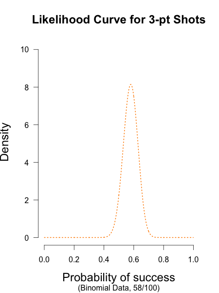
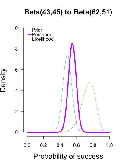
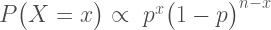
Imagine we’re in a similar situation as before: I’ve flipped a coin 100 times and it came up 60 heads and 40 tails. The likelihood function for binomial data in general is:

\ P \big(X = x \big) \propto \ p^x \big(1-p \big)^{n-x}

and for this particular result:

\ P \big(X = 60 \big) \propto \ p^{60} \big(1-p \big)^{40}

The corresponding likelihood curve is shown below, which displays the relative likelihood for all possible simple (point) hypotheses given this data. Any likelihood ratio can be calculated by simply taking the ratio of the different hypotheses’s heights on the curve.

fig1

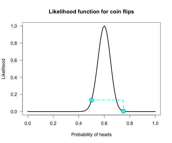
In that previous post I compared the fair coin hypothesis — H0: P(H)=.5 — vs one particular trick coin hypothesis — H1: P(H)=.75. For 60 heads out of 100 tosses, the likelihood ratio for these hypotheses is L(.5)/L(.75) = 29.9. This means the data are 29.9 times as probable under the fair coin hypothesis than this particular trick coin hypothesisBut often we don’t have theories precise enough to make point predictions about parameters, at least not in psychology. So it’s often helpful if we can assign a range of plausible values for parameters as dictated by our theories.

Enter the Bayes factor

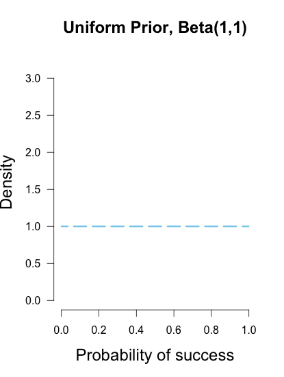
Calculating a Bayes factor is a simple extension of this process. A Bayes factor is a weighted average likelihood ratio, where the weights are based on the prior distribution specified for the hypotheses. For this example I’ll keep the simple fair coin hypothesis as the null hypothesis — H0: P(H)=.5 — but now the alternative hypothesis will become a composite hypothesis — H1: P(θ). (footnote 1) The likelihood ratio is evaluated at each point of P(θ) and weighted by the relative plausibility we assign that value. Then once we’ve assigned weights to each ratio we just take the average to get the Bayes factor. Figuring out how the weights should be assigned (the prior) is the tricky part.

Imagine my composite hypothesis, P(θ), is a combination of 21 different point hypotheses, all evenly spaced out between 0 and 1 and all of these points are weighted equally (not a very realistic hypothesis!). So we end up with P(θ) = {0, .05, .10, .15, . . ., .9, .95, 1}. The likelihood ratio can be evaluated at every possible point hypothesis relative to H0, and we need to decide how to assign weights. This is easy for this P(θ); we assign zero weight for every likelihood ratio that is not associated with one of the point hypotheses contained in P(θ), and we assign weights of 1 to all likelihood ratios associated with the 21 points in P(θ).

This gif has the 21 point hypotheses of P(θ) represented as blue vertical lines (indicating where we put our weights of 1), and the turquoise tracking lines represent the likelihood ratio being calculated at every possible point relative to H0: P(H)=.5. (Remember, the likelihood ratio is the ratio of the heights on the curve.) This means we only care about the ratios given by the tracking lines when the dot attached to the moving arm aligns with the vertical P(θ) lines. [edit: this paragraph added as clarification]
gif11

The 21 likelihood ratios associated with P(θ) are:

{~0, ~0, ~0, ~0, ~0, ~0, ~0, ~0, .002, .08, 1, 4.5, 7.5, 4.4, .78, .03, ~0, ~0, ~0, ~0, ~0}

Since they are all weighted equally we simply average, and obtain BF = 18.3/21 = .87. In other words, the data (60 heads out of 100) are 1/.87 = 1.15 times more probable under the null hypothesis — H0: P(H)=.5 — than this particular composite hypothesis — H1: P(θ). Entirely uninformative! Despite tossing the coin 100 times we have extremely weak evidence that is hardly worth even acknowledging. This happened because much of P(θ) falls in areas of extremely low likelihood relative to H0, as evidenced by those 13 zeros above. P(θ) is flexible, since it covers the entire possible range of θ, but this flexibility comes at a price. You have to pay for all of those zeros with a lower weighted average and a smaller Bayes factor.

Now imagine I had seen a trick coin like this before, and I know it had a slight bias towards landing heads. I can use this information to make more pointed predictions. Let’s say I define P(θ) as 21 equally weighted point hypotheses again, but this time they are all equally spaced between .5 and .75, which happens to be the highest density region of the likelihood curve (how fortuitous!). Now P(θ) = {.50, .5125, .525, . . ., .7375, .75}.
gif22

The 21 likelihood ratios associated with the new P(θ) are:

{1.00, 1.5, 2.1, 2.8, 4.5, 5.4, 6.2, 6.9, 7.5, 7.3, 6.9, 6.2, 4.4, 3.4, 2.6, 1.8, .78, .47, .27, .14, .03}

They are all still weighted equally, so the simple average is BF = 72/21 = 3.4. Three times more informative than before, and in favor of P(θ) this time! And no zeros. We were able to add theoretically relevant information to H1 to make more accurate predictions, and we get rewarded with a Bayes boost. (But this result is only 3-to-1 evidence, which is still fairly weak.)

This new P(θ) is risky though, because if the data show a bias towards tails or a more extreme bias towards heads then it faces a very heavy penalty (many more zeros). High risk = high reward with the Bayes factor. Make pointed predictions that match the data and get a bump to your BF, but if you’re wrong then pay a steep price. For example, if the data were 60 tails instead of 60 heads the BF would be 10-to-1 against P(θ) rather than 3-to-1 for P(θ)!

Now, typically people don’t actually specify hypotheses like these. Typically they use continuous distributions, but the idea is the same. Take the likelihood ratio at each point relative to H0, weigh according to plausibilities given in P(θ), and then average.

A more realistic (?) example

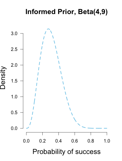
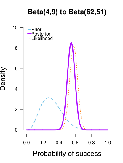
Imagine you’re walking down the sidewalk and you see a shiny piece of foreign currency by your feet. You pick it up and want to know if it’s a fair coin or an unfair coin. As a Bayesian you have to be precise about what you mean by fair and unfair. Fair is typically pretty straightforward — H0: P(H)=.5 as before — but unfair could mean anything. Since this is a completely foreign coin to you, you may want to be fairly open-minded about it. After careful deliberation, you assign P(θ) a beta distribution, with shape parameters 10 and 10. That is, H1: P(θ) ~ Beta(10, 10). This means that if the coin isn’t fair, it’s probably close to fair but it could reasonably be moderately biased, and you have no reason to think it is particularly biased to one side or the other.

prior1010

Now you build a perfect coin-tosser machine and set it to toss 100 times (but not any more than that because you haven’t got all day). You carefully record the results and the coin comes up 33 heads out of 100 tosses. Under which hypothesis are these data more probable, H0 or H1? In other words, which hypothesis did the better job predicting these data?

This may be a continuous prior but the concept is exactly the same as before: weigh the various likelihood ratios based on the prior plausibility assignment and then average. The continuous distribution on P(θ) can be thought of as a set of many many point hypotheses spaced very very close together. So if the range of θ we are interested in is limited to 0 to 1, as with binomials and coin flips, then a distribution containing 101 point hypotheses spaced .01 apart, can effectively be treated as if it were continuous. The numbers will be a little off but all in all it’s usually pretty close. So imagine that instead of 21 hypotheses you have 101, and their relative plausibilities follow the shape of a Beta(10, 10). (footnote 2)

gif33

Since this is not a uniform distribution, we need to assign varying weights to each likelihood ratio. Each likelihood ratio associated with a point in P(θ) is simply multiplied by the respective density assigned to it under P(θ). For example, the density of P(θ) at .4 is 2.44. So we multiply the likelihood ratio at that point, L(.4)/L(.5) = 128, by 2.44, and add it to the accumulating total likelihood ratio. Do this for every point and then divide by the total number of points, in this case 101, to obtain the approximate Bayes factor. The total weighted likelihood ratio is 5564.9, divide it by 101 to get 55.1, and there’s the Bayes factor. In other words, the data are roughly 55 times more probable under this composite H1 than under H0. The alternative hypothesis H1 did a much better job predicting these data than did the null hypothesis H0.

The actual Bayes factor is obtained by integrating the likelihood with respect to H1’s density distribution and then dividing by the (marginal) likelihood of H0. Essentially what it does is cut P(θ) into slices infinitely thin before it calculates the likelihood ratios, re-weighs, and averages. That Bayes factor comes out to 55.7, which is basically the same thing we got through this ghetto visualization demonstration!

Take home

The take-home message is hopefully pretty clear at this point: When you are comparing a point null hypothesis with a composite hypothesis, the Bayes factor can be thought of as a weighted average of every point hypothesis’s likelihood ratio against H0, and the weights are determined by the prior density distribution of H1. Since the Bayes factor is a weighted average based on the prior distribution, it’s really important to think hard about the prior distribution you choose for H1. In a previous post, I showed how different priors can converge to the same posterior with enough data. The priors are often said to “wash out” in estimation problems like that. This is not necessarily the case for Bayes factors. The priors you choose matter, so think hard!

Notes

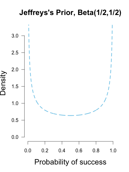
Footnote 1: A lot of ink has been spilled arguing about how one should define P(θ). I talked about it a little a previous post.

Footnote 2: I’ve rescaled the likelihood curve to match the scale of the prior density under H1. This doesn’t affect the values of the Bayes factor or likelihood ratios because the scaling constant cancels itself out.

R code

## Plots the likelihood function for the data obtained
## h = number of successes (heads), n = number of trials (flips),
## p1 = prob of success (head) on H1, p2 = prob of success (head) on H0
#the auto plot loop is taken from http://www.r-bloggers.com/automatically-save-your-plots-to-a-folder/
#and then the pngs are combined into a gif online
LR <- function(h,n,p1=seq(0,1,.01),p2=rep(.5,101)){
L1 <- dbinom(h,n,p1)/dbinom(h,n,h/n) ## Likelihood for p1, standardized vs the MLE
L2 <- dbinom(h,n,p2)/dbinom(h,n,h/n) ## Likelihood for p2, standardized vs the MLE
Ratio <<- dbinom(h,n,p1)/dbinom(h,n,p2) ## Likelihood ratio for p1 vs p2, saves to global workspace with <<-
x<- seq(0,1,.01) #sets up for loop
m<- seq(0,1,.01) #sets up for p(theta)
ym<-dbeta(m,10,10) #p(theta) densities
names<-seq(1,length(x),1) #names for png loop
for(i in 1:length(x)){
mypath<-file.path("~","Dropbox","Blog Drafts","bfs","figs1",paste("myplot_", names[i], ".png", sep = "")) #set up for save file path
png(file=mypath, width=1200,height=1000,res=200) #the next plotted item saves as this png format
curve(3.5*(dbinom(h,n,x)/max(dbinom(h,n,h/n))), ylim=c(0,3.5), xlim = c(0,1), ylab = "Likelihood",
xlab = "Probability of heads",las=1, main = "Likelihood function for coin flips", lwd = 3)
lines(m,ym, type="h", lwd=1, lty=2, col="skyblue" ) #p(theta) density
points(p1[i], 3.5*L1[i], cex = 2, pch = 21, bg = "cyan") #tracking dot
points(p2, 3.5*L2, cex = 2, pch = 21, bg = "cyan") #stationary null dot
#abline(v = h/n, lty = 5, lwd = 1, col = "grey73") #un-hash if you want to add a line at the MLE
lines(c(p1[i], p1[i]), c(3.5*L1[i], 3.6), lwd = 3, lty = 2, col = "cyan") #adds vertical line at p1
lines(c(p2[i], p2[i]), c(3.5*L2[i], 3.6), lwd = 3, lty = 2, col = "cyan") #adds vertical line at p2, fixed at null
lines(c(p1[i], p2[i]), c(3.6, 3.6), lwd=3,lty=2,col="cyan") #adds horizontal line connecting them
dev.off() #lets you save directly
}
}
LR(33,100) #executes the final example
v<-seq(0,1,.05) #the segments of P(theta) when it is uniform
sum(Ratio[v]) #total weighted likelihood ratio
mean(Ratio[v]) #average weighted likelihood ratio (i.e., BF)
x<- seq(0,1,.01) #segments for p(theta)~beta
y<-dbeta(x,10,10) #assigns densitys for P(theta)
k=sum(y*Ratio) #multiply likelihood ratios by the density under P(theta)
l=k/101 #weighted average likelihood ratio (i.e., BF)
view raw BF_visuals.R hosted with ❤ by GitHub

The general public has no idea what “statistically significant” means

The title of this piece shouldn’t shock anyone who has taken an introductory statistics course. Statistics is full of terms that have a specific statistical meaning apart from their everyday meaning. A few examples:

Significant, confidence, power, random, mean, normal, credible, moment, bias, interaction, likelihood, error, loadings, weights, hazard, risk, bootstrap, information, jack-knife, kernel, reliable, validity; and that’s just the tip of the iceberg. (Of course, one’s list gets bigger the more statistics courses one takes.)

It should come as no surprise that the general public mistakes a term’s statistical meaning for its general english meaning when nearly every word has some sort of dual-meaning.

Philip Tromovitch (2015) has recently put out a neat paper in which he surveyed a little over 1,000 members of the general public on their understanding of the meaning of “significant,” a term which has a very precise statistical definition: assuming the null hypothesis is true (usually defined as no effect), discrepancies as large or larger than this result would be so rare that we should act as if the null hypothesis isn’t true and we won’t often be wrong.

However, in everyday english, something that is significant means that it is noteworthy or worth our attention. Rather than give a cliched dictionary definition, I asked my mother what she thought. She says she would interpret a phrase such as, “there was a significant drop in sales from 2013 to 2014” to indicate that the drop in sales was “pretty big, like quite important.” (thanks mom 🙂 ) But that’s only one person. What did Tromovitch’s survey respondents think?

Tromovitch surveyed a total of 1103 people. He asked 611 of his respondents to answer this multiple choice question, and the rest answered a variant as an open ended question. Here is the multiple choice question to his survey respondents:

When scientists declare that the finding in their study is “significant,” which of the following do you suspect is closest to what they are saying:

  • the finding is large
  • the finding is important
  • the finding is different than would be expected by chance
  • the finding was unexpected
  • the finding is highly accurate
  • the finding is based on a large sample of data

Respondents choosing the first two responses were considered to be incorrectly using general english, choosing the third answer was considered correct, and choosing any of the final three were considered other incorrect answer. He separated general public responses from those with doctorate degrees (n=15), but he didn’t get any information on what topic their degree was in, so I’ll just refer to the rest of the sample’s results from here on since the doctorate sample should really be taken with a grain of salt.

Roughly 50% of respondents gave a general english interpretation of the “significant” results (options 1 or 2), roughly 40% chose one of the other three wrong responses (options 4, 5, or 6), and less than 10% actually chose the correct answer (option 3). Even if they were totally guessing you’d expect them to get close to 17% correct (1/6), give or take.

But perhaps multiple choice format isn’t the best way to get at this, since the prompt itself provides many answers that sound perfectly reasonable. Tromovitch also asked this as an open-ended question to see what kind of responses people would generate themselves. One variant of the prompt explicitly mentions that he wants to know about statistical significance, while the other simply mentions significance. The exact wording was this:

Scientists sometimes conclude that the finding in their study is “[statistically] significant.” If you were updating a dictionary of modern American English, how would you define the term “[statistically] significant”?

Did respondents do any better when they can answer freely? Not at all. Neither prompt had a very high success rate; they had correct response rates at roughly 4% and 1%. This translates to literally 12 correct answers out of the total 492 respondents of both prompts combined (including phd responses). Tromovitch includes all of these responses in the appendix so you can read the kinds of answers that were given and considered to be correct.

If you take a look at the responses you’ll see that most of them imply some statement about the probability of one hypothesis or the other being true, which isn’t allowed by the correct definition of statistical significance! For example, one answer coded as correct said, “The likelihood that the result/findings are not due to chance and probably true” is blatantly incorrect. The probability that the results are not due to chance is not what statistical significance tells you at all. Most of the responses coded as “correct” by Tromovitch are quite vague, so it’s not clear that even those correct responders have a good handle on the concept. No wonder the general public looks at statistics as if they’re some hand-wavy magic. They don’t get it at all.

snape 2

My takeaway from this study is the title of this piece: the general public has no idea what statistical significance means. That’s not surprising when you consider that researchers themselves often don’t know what it means! Even professors who teach research methods and statistics get this wrong. Results from Haller & Krauss (2002), building off of Oakes (1986), suggest that it is normal for students, academic researchers, and even methodology instructors to endorse incorrect interpretations of p-values and significance tests. That’s pretty bad. It’s one thing for first-year students or the lay public to be confused, but educated academics and methodology instructors too? If you don’t buy the survey results, open up any journal issue in any psychology journal and you’ll find tons of examples of misinterpretation and confusion.

Recently Hoekstra, Morey, Rouder, & Wagenmakers (2014) demonstrated that confidence intervals are similarly misinterpreted by researchers, despite recent calls (Cumming, 2014) to totally abandon significance tests in lieu of confidence intervals. Perhaps we could toss out the whole lot and start over with something that actually makes sense? Maybe we could try teaching something that people can actually understand?

I’ve heard of this cool thing called Bayesian statistics we could try.


References

Cumming, G. (2014). The new statistics: Why and how. Psychological Science25(1), 7-29.

Haller, H., & Krauss, S. (2002). Misinterpretations of significance: A problem students share with their teachers. Methods of Psychological Research, 7(1), 1-20.

Hoekstra, R., Morey, R. D., Rouder, J. N., & Wagenmakers, E. J. (2014). Robust misinterpretation of confidence intervals. Psychonomic Bulletin & Review, 21(5), 1157-1164.

Oakes, M. W. (1986). Statistical inference: A commentary for the social and behavioural sciences. Wiley.

Tromovitch, P. (2015). The lay public’s misinterpretation of the meaning of ‘significant’: A call for simple yet significant changes in scientific reporting. Journal of Research Practice, 1(1), 1.

Understanding Bayes: Updating priors via the likelihood

[Some material from this post has been incorporated into a paper to be published in AMPPS]

In a previous post I outlined the basic idea behind likelihoods and likelihood ratios. Likelihoods are relatively straightforward to understand because they are based on tangible data. Collect your data, and then the likelihood curve shows the relative support that your data lend to various simple hypotheses. Likelihoods are a key component of Bayesian inference because they are the bridge that gets us from prior to posterior.

In this post I explain how to use the likelihood to update a prior into a posterior. The simplest way to illustrate likelihoods as an updating factor is to use conjugate distribution families (Raiffa & Schlaifer, 1961). A prior and likelihood are said to be conjugate when the resulting posterior distribution is the same type of distribution as the prior. This means that if you have binomial data you can use a beta prior to obtain a beta posterior. If you had normal data you could use a normal prior and obtain a normal posterior. Conjugate priors are not required for doing bayesian updating, but they make the calculations a lot easier so they are nice to use if you can.

I’ll use some data from a recent NCAA 3-point shooting contest to illustrate how different priors can converge into highly similar posteriors.

The data

This year’s NCAA shooting contest was a thriller that saw Cassandra Brown of the Portland Pilots win the grand prize. This means that she won the women’s contest and went on to defeat the men’s champion in a shoot-off. This got me thinking, just how good is Cassandra Brown?

What a great chance to use some real data in a toy example. She completed 4 rounds of shooting, with 25 shots in each round, for a total of 100 shots (I did the math). The data are counts, so I’ll be using the binomial distribution as a data model (i.e., the likelihood. See this previous post for details). Her results were the following:

Round 1: 13/25               Round 2: 12/25               Round 3: 14/25               Round 4: 19/25

Total: 58/100

The likelihood curve below encompasses the entirety of statistical evidence that our 3-point data provide (footnote 1). The hypothesis with the most relative support is .58, and the curve is moderately narrow since there are quite a few data points. I didn’t standardize the height of the curve in order to keep it comparable to the other curves I’ll be showing.

fig1likelihood

The prior

Now the part that people often make a fuss about: choosing the prior. There are a few ways to choose a prior. Since I am using a binomial likelihood, I’ll be using a conjugate beta prior. A beta prior has two shape parameters that determine what it looks like, and is denoted Beta(α, β). I like to think of priors in terms of what kind of information they represent. The shape parameters α and β can be thought of as prior observations that I’ve made (or imagined).

Imagine my trusted friend caught the end of Brown’s warm-up and saw her take two shots, making one and missing the other, and she tells me this information. This would mean I could reasonably use the common Beta(1, 1) prior, which represents a uniform density over [0, 1]. In other words, all possible values for Brown’s shooting percentage are given equal weight before taking data into account, because the only thing I know about her ability is that both outcomes are possible (Lee & Wagenmakers, 2005).

Another common prior is called Jeffreys’s prior, a Beta(1/2, 1/2) which forms a wide bowl shape. This prior would be recommended if you had extremely scarce information about Brown’s ability. Is Brown so good that she makes nearly every shot, or is she so bad that she misses nearly every shot? This prior says that Brown’s shooting rate is probably near the extremes, which may not necessarily reflect a reasonable belief for someone who is a college basketball player, but it has the benefit of having less influence on the posterior estimates than the uniform prior (since it is equal to 1 prior observation instead of 2). Jeffreys’s prior is popular because it has some desirable properties, such as invariance under parameter transformation (Jaynes, 2003). So if instead of asking about Brown’s shooting percentage I instead wanted to know her shooting percentage squared or cubed, Jeffreys’s prior would remain the same shape while many other priors would drastically change shape.

Or perhaps I had another trusted friend who had arrived earlier and seen Brown take her final 13 shots in warm-up, and she saw 4 makes and 9 misses. Then I could use a Beta(4, 9) prior to characterize this prior information, which looks like a hump over .3 with density falling slowly as it moves outward in either direction. This prior has information equivalent to 13 shots, or roughly an extra 1/2 round of shooting.

These three different priors are shown below.

prioruni priorjeff priorinformed

These are but three possible priors one could use. In your analysis you can use any prior you want, but if you want to be taken seriously you’d better give some justification for it. Bayesian inference allows many rules for prior construction.”This is my personal prior” is a technically a valid reason, but if this is your only justification then your colleagues/reviewers/editors will probably not take your results seriously.

Updating the prior via the likelihood

Now for the easiest part. In order to obtain a posterior, simply use Bayes’s rule:

\ Posterior \propto Likelihood \ X \ Prior

The posterior is proportional to the likelihood multiplied by the prior. What’s nice about working with conjugate distributions is that Bayesian updating really is as simple as basic algebra. We take the formula for the binomial likelihood, which from a previous post is known to be:

\ Likelihood \ = \ p^x \big(1-p \big)^{n-x}   

and then multiply it by the formula for the beta prior with α and β shape parameters:

\ Prior \ = \ p^{\alpha-1} \big(1-p \big)^{\beta-1}   

to obtain the following formula for the posterior:

\ Posterior \ = \ p^x \big(1-p \big)^{n-x} p^{\alpha-1} \big(1-p \big)^{\beta-1}   

With a little bit of algebra knowledge, you’ll know that multiplying together terms with the same base means the exponents can be added together. So the posterior formula can be rewritten as:

\ Posterior \ = \ p^x p^{\alpha-1}\big(1-p \big)^{n-x} \big(1-p \big)^{\beta-1}

and then by adding the exponents together the formula simplifies to:

\ Posterior \ = \ p^{\alpha-1+x} \big(1-p \big)^{\beta-1+n-x}   

and it’s that simple! Take the prior, add the successes and failures to the different exponents, and voila. The distributional notation is even simpler. Take the prior, Beta(α, β), and add the successes from the data, x, to α and the failures, n – x, to β, and there’s your posterior, Beta(α+x, β+n-x).

Remember from the previous post that likelihoods don’t care about what order the data arrive in, it always results in the same curve. This property of likelihoods is carried over to posterior updating. The formulas above serve as another illustration of this fact. It doesn’t matter if you add a string of six single data points, 1+1+1+1+1+1+1 or a batch of +6 data points; the posterior formula in either case ends up with 6 additional points in the exponents.

Looking at some posteriors

Back to Brown’s shooting data. She had four rounds of shooting so I’ll treat each round as a batch of new data. Her results for each round were: 13/25, 12/25, 14/25, 19/25. I’ll show how the different priors are updated with each batch of data. A neat thing about bayesian updating is that after batch 1 is added to the initial prior, its posterior is used as the prior for the next batch of data. And as the formulas above indicate, the order or frequency of additions doesn’t make a difference on the final posterior. I’ll verify this at the end of the post.

In the following plots, the prior is shown in blue (as above), the likelihood in orange (as above), and the resulting posteriors after Brown’s first 13/25 makes in purple.

post1uni post1jeff post1informed

In the first and second plot the likelihood is nearly invisible because the posterior sits right on top of it. When the prior has only 1 or 2 data points worth of information, it has essentially no impact on the posterior shape (footnote 2). The third plot shows how the posterior splits the difference between the likelihood and the informed prior based on the relative quantity of information in each.

The posteriors obtained from the uniform and Jeffreys’s priors suggest the best guess for Brown’s shooting percentage is around 50%, whereas the posterior obtained from the informed prior suggests it is around 40%. No surprise here since the informed prior represents another 1/2 round of shots where Brown performed poorly, which shifts the posterior towards lower values. But all three posteriors are still quite broad, and the breadth of the curves can be thought to represent the uncertainty in my estimates. More data -> tighter curves -> less uncertainty.

Now I’ll add the second round performance as a new likelihood (12/25 makes), and I’ll take the posteriors from the first round of updating as new priors for the second round of updating. So the purple posteriors from the plots above are now blue priors, the likelihood is orange again, and the new posteriors are purple.

post2uni post2jeff post2informed

The left two plots look nearly identical, which should be no surprise since their posteriors were essentially equivalent after only 1 round of data updates. The third plot shows a posterior still slightly shifted to the left of the others, but it is much more in line with them than before. All three posteriors are getting narrower as more data is added.

The last two rounds of updating are shown below, again with posteriors from the previous round taken as priors for the next round. At this point they’ve all converged to very similar posteriors that are much narrower, translating to less uncertainty in my estimates.

post3uni post3jeff post3informed post4uni post4jeff post4informed

These posterior distributions look pretty similar now! Just as an illustration, I’ll show what happens when I update the initial priors with all of the data at once.

postfinaluni postfinaljeff postfinalinformed

As the formulas predict, the posteriors after one big batch of data are identical to those obtained by repeatedly adding multiple smaller batches of data. It’s also a little easier to see the discrepancies between the final posteriors in this illustration because the likelihood curve acts as a visual anchor. The uniform and Jeffreys’s priors result in posteriors that essentially fall right on top of the likelihood, whereas the informed prior results in a posterior that is very slightly shifted to the left of the likelihood.

My takeaway from these posteriors is that Cassandra Brown has a pretty damn good 3-point shot! In a future post I’ll explain how to use this method of updating to make inferences using Bayes factors. It’s called the Savage-Dickey density method, and I think it’s incredibly intuitive and easy to use.

Notes:

Footnote 1: I’m making a major assumption about the data: Any one shot is exchangeable with any other shot. This might not be defensible since the final ball on each rack is worth a bonus point, so maybe those shots differ systematically from regular shots, but it’s a toy example so I’ll ignore that possibility. There’s also the possibility of her going on a hot streak, a.k.a. having a “hot hand”, but I’m going to ignore that too because I’m the one writing this blog post and I want to keep it simple. There’s also the possibility that she gets worse throughout the competition because she gets tired, but then there’s also the possibility that she gets better as she warms up with multiple rounds. All of these things are reasonable to consider and I am going to ignore them all.

Footnote 2: There is a tendency to call any priors that have very little impact on the posterior “non-informative”, but, as I mentioned in the section on determining priors, uniform priors that seem non-informative in one context can become highly informative with parameter transformation (Zhu & Lu, 2004). Jeffreys’s prior was derived precisely with that in mind, so it carries little information no matter what transformation is applied.

R Code

shotData<- c(1, 0, 0, 0, 1, 0, 1, 0, 1, 0, 0, 0, 1, 1, 1, 0, 1, 0, 1, 1, 1, 0, 0, 1, 1, 0, 0,
1, 1, 1, 0, 0, 1, 1, 0, 0, 0, 1, 1, 1, 0, 0, 0, 0, 1, 1, 0, 1, 1, 0, 1, 0, 0, 1,
0, 1, 0, 1, 1, 1, 0, 1, 0, 1, 0, 0, 1, 1, 0, 1, 0, 0, 1, 1, 1, 1, 1, 1, 1, 1, 1,
1, 1, 1, 0, 0, 1, 1, 0, 0, 1, 1, 1, 0, 1, 1, 1, 1, 1, 0)
#figure 1 from blog, likelihood curve for 58/100 shots
x = seq(.001, .999, .001) ##Set up for creating the distributions
y2 = dbeta(x, 1 + 58, 1 + 42) # data for likelihood curve, plotted as the posterior from a beta(1,1)
plot(x, y2, xlim=c(0,1), ylim=c(0, 1.25 * max(y2,1.6)), type = "l", ylab= "Density", lty = 3,
xlab= "Probability of success", las=1, main="Likelihood Curve for 3-pt Shots", sub= "(Binomial Data, 58/100)",lwd=2,
cex.lab=1.5, cex.main=1.5, col = "darkorange", axes=FALSE)
axis(1, at = seq(0,1,.2)) #adds custom x axis
axis(2, las=1) # custom y axis
## Function for plotting priors, likelihoods, and posteriors for binomial data
## Output consists of a plot and various statistics
## PS and PF determine the shape of the prior distribution.
## PS = prior success, PF = prior failure for beta dist.
## PS = 1, PF = 1 corresponds to uniform(0,1) and is default. If left at default, posterior will be equivalent to likelihood
## k = number of observed successes in the data, n = total trials. If left at 0 only plots the prior dist.
## null = Is there a point-null hypothesis? null = NULL leaves it out of plots and calcs
## CI = Is there a relevant X% credibility interval? .95 is recommended and standard
plot.beta <- function(PS = 1, PF = 1, k = 0, n = 0, null = NULL, CI = NULL, ymax = "auto", main = NULL) {
x = seq(.001, .999, .001) ##Set up for creating the distributions
y1 = dbeta(x, PS, PF) # data for prior curve
y3 = dbeta(x, PS + k, PF + n - k) # data for posterior curve
y2 = dbeta(x, 1 + k, 1 + n - k) # data for likelihood curve, plotted as the posterior from a beta(1,1)
if(is.numeric(ymax) == T){ ##you can specify the y-axis maximum
y.max = ymax
}
else(
y.max = 1.25 * max(y1,y2,y3,1.6) ##or you can let it auto-select
)
if(is.character(main) == T){
Title = main
}
else(
Title = "Prior-to-Posterior Transformation with Binomial Data"
)
plot(x, y1, xlim=c(0,1), ylim=c(0, y.max), type = "l", ylab= "Density", lty = 2,
xlab= "Probability of success", las=1, main= Title,lwd=3,
cex.lab=1.5, cex.main=1.5, col = "skyblue", axes=FALSE)
axis(1, at = seq(0,1,.2)) #adds custom x axis
axis(2, las=1) # custom y axis
if(n != 0){
#if there is new data, plot likelihood and posterior
lines(x, y2, type = "l", col = "darkorange", lwd = 2, lty = 3)
lines(x, y3, type = "l", col = "darkorchid1", lwd = 5)
legend("topleft", c("Prior", "Posterior", "Likelihood"), col = c("skyblue", "darkorchid1", "darkorange"),
lty = c(2,1,3), lwd = c(3,5,2), bty = "n", y.intersp = .55, x.intersp = .1, seg.len=.7)
## adds null points on prior and posterior curve if null is specified and there is new data
if(is.numeric(null) == T){
## Adds points on the distributions at the null value if there is one and if there is new data
points(null, dbeta(null, PS, PF), pch = 21, bg = "blue", cex = 1.5)
points(null, dbeta(null, PS + k, PF + n - k), pch = 21, bg = "darkorchid", cex = 1.5)
abline(v=null, lty = 5, lwd = 1, col = "grey73")
##lines(c(null,null),c(0,1.11*max(y1,y3,1.6))) other option for null line
}
}
##Specified CI% but no null? Calc and report only CI
if(is.numeric(CI) == T && is.numeric(null) == F){
CI.low <- qbeta((1-CI)/2, PS + k, PF + n - k)
CI.high <- qbeta(1-(1-CI)/2, PS + k, PF + n - k)
SEQlow<-seq(0, CI.low, .001)
SEQhigh <- seq(CI.high, 1, .001)
##Adds shaded area for x% Posterior CIs
cord.x <- c(0, SEQlow, CI.low) ##set up for shading
cord.y <- c(0,dbeta(SEQlow,PS + k, PF + n - k),0) ##set up for shading
polygon(cord.x,cord.y,col='orchid', lty= 3) ##shade left tail
cord.xx <- c(CI.high, SEQhigh,1)
cord.yy <- c(0,dbeta(SEQhigh,PS + k, PF + n - k), 0)
polygon(cord.xx,cord.yy,col='orchid', lty=3) ##shade right tail
return( list( "Posterior CI lower" = round(CI.low,3), "Posterior CI upper" = round(CI.high,3)))
}
##Specified null but not CI%? Calculate and report BF only
if(is.numeric(null) == T && is.numeric(CI) == F){
null.H0 <- dbeta(null, PS, PF)
null.H1 <- dbeta(null, PS + k, PF + n - k)
CI.low <- qbeta((1-CI)/2, PS + k, PF + n - k)
CI.high <- qbeta(1-(1-CI)/2, PS + k, PF + n - k)
return( list("BF01 (in favor of H0)" = round(null.H1/null.H0,3), "BF10 (in favor of H1)" = round(null.H0/null.H1,3)
))
}
##Specified both null and CI%? Calculate and report both
if(is.numeric(null) == T && is.numeric(CI) == T){
null.H0 <- dbeta(null, PS, PF)
null.H1 <- dbeta(null, PS + k, PF + n - k)
CI.low <- qbeta((1-CI)/2, PS + k, PF + n - k)
CI.high <- qbeta(1-(1-CI)/2, PS + k, PF + n - k)
SEQlow<-seq(0, CI.low, .001)
SEQhigh <- seq(CI.high, 1, .001)
##Adds shaded area for x% Posterior CIs
cord.x <- c(0, SEQlow, CI.low) ##set up for shading
cord.y <- c(0,dbeta(SEQlow,PS + k, PF + n - k),0) ##set up for shading
polygon(cord.x,cord.y,col='orchid', lty= 3) ##shade left tail
cord.xx <- c(CI.high, SEQhigh,1)
cord.yy <- c(0,dbeta(SEQhigh,PS + k, PF + n - k), 0)
polygon(cord.xx,cord.yy,col='orchid', lty=3) ##shade right tail
return( list("BF01 (in favor of H0)" = round(null.H1/null.H0,3), "BF10 (in favor of H1)" = round(null.H0/null.H1,3),
"Posterior CI lower" = round(CI.low,3), "Posterior CI upper" = round(CI.high,3)))
}
}
#plot dimensions (415,550) for the blog figures
#Initial Priors
plot.beta(1,1,ymax=3.2,main="Uniform Prior, Beta(1,1)")
plot.beta(.5,.5,ymax=3.2,main="Jeffreys's Prior, Beta(1/2,1/2)")
plot.beta(4,9,ymax=3.2,main="Informed Prior, Beta(4,9)")
#Posteriors after Round 1
plot.beta(1,1,13,25,main="Beta(1,1) to Beta(14,13)",ymax=10)
plot.beta(.5,.5,13,25,main="Beta(1/2,1/2) to Beta(13.5,12.5)",ymax=10)
plot.beta(4,9,13,25,main="Beta(4,9) to Beta(17,21)",ymax=10)
#Posteriors after Round 2
plot.beta(14,13,12,25,ymax=10,main="Beta(14,13) to Beta(26,26)")
plot.beta(13.5,12.5,12,25,ymax=10,main="Beta(13.5,12.5) to Beta(25.5,25.5)")
plot.beta(17,21,12,25,ymax=10,main="Beta(17,21) to Beta(29,34)")
#Posteriors after Round 3
plot.beta(26,26,14,25,ymax=10,main="Beta(26,26) to Beta(40,37)")
plot.beta(25.5,25.5,14,25,ymax=10,main="Beta(25.5,25.5) to Beta(39.5,36.5)")
plot.beta(29,34,14,25,ymax=10,main="Beta(29,34) to Beta(43,45)")
#Posteriors after Round 4
plot.beta(40,37,19,25,ymax=10,main="Beta(40,37) to Beta(59,43)")
plot.beta(39.5,36.5,19,25,ymax=10,main="Beta(39.5,36.5) to Beta(58.5,42.5)")
plot.beta(43,45,19,25,ymax=10,main="Beta(43,45) to Beta(62,51)")
#Initial Priors and final Posteriors after all rounds at once
plot.beta(1,1,58,100,ymax=10,main="Beta(1,1) to Beta(59,43)")
plot.beta(.5,.5,58,100,ymax=10,main="Beta(1/2,1/2) to Beta(58.5,42.5)")
plot.beta(4,9,58,100,ymax=10,main="Beta(4,9) to Beta(62,51)")
view raw updating.R hosted with ❤ by GitHub

References:

Jaynes, E. T. (2003). Probability theory: The logic of science. Cambridge University Press.

Lee, M. D., & Wagenmakers, E. J. (2005). Bayesian statistical inference in psychology: Comment on Trafimow (2003). Psychological Review, 112(3), 662-668.

Raiffa, H. & Schlaifer, R. (1961). Applied statistical decision theory. Division of Research, Graduate School of Business Administration, Harvard University.

Zhu, M., & Lu, A. Y. (2004). The counter-intuitive non-informative prior for the Bernoulli family. Journal of Statistics Education, 12(2), 1-10.

Type-S and Type-M errors

An anonymous reader of the blog emailed me:
 –
I wonder if you’d be ok to help me to understanding this Gelman’s  graphI struggle to understand what is the plotted distribution and the exact meaning of the red area. Of course I read the related article, but it doesn’t help me much.
Rather than write a long-winded email, I figured it will be easier to explain on the blog using some step by step illustrations. With the anonymous reader’s permission I am sharing the question and this explanation for all to read. The graph in question is reproduced below. I will walk through my explanation by building up to this plot piecewise with the information we have about the specific situation referenced in the related paper. The paper, written by Andrew Gelman and John Carlin, illustrates the concepts of Type-M errors and Type-S errors. From the paper:
We frame our calculations not in terms of Type 1 and Type 2 errors but rather Type S (sign) and Type M (magnitude) errors, which relate to the probability that claims with confidence have the wrong sign or are far in magnitude from underlying effect sizes (p. 2)
So Gelman’s graph is an attempt to illustrate these types of errors. I won’t go into the details of the paper since you can read it yourself! I was asked to explain this graph though, which isn’t in the paper, so we’ll go through step by step building our own type-s/m graph in order to build an understanding. The key idea is this: if the underlying true population mean is small and sampling error is large, then experiments that achieve statistical significance must have exaggerated effect sizes and are likely to have the wrong sign. The graph in question:
gelmanPlot
A few technical details: Here Gelman is plotting a sampling distribution for a hypothetical experiment. If one were to repeatedly take a sample from a population, then each sample mean would be different from the true population mean by some amount due to random variation. When we run an experiment, we essentially pick a sample mean from this distribution at random. Picking at random, sample means tend to be near the true mean of the population, and the how much these random sample means vary follows a curve like this. The height of the curve represents the relative frequency for a sample mean in a series of random picks. Obtaining sample means far away from the true mean is relatively rare since the height of the curve is much lower the farther out we go from the population mean. The red shaded areas indicate values of sample means that achieve statistical significance (i.e., exceed some critical value).
 –
The distribution’s form is determined by two parameters: a location parameter and a scale parameter. The location parameter is simply the mean of the distribution (μ), and the scale parameter is the standard deviation of the distribution (σ). In this graph, Gelman defines the true population mean to be 2 based on his experience in this research area; the standard deviation is equal to the sampling error (standard error) of our procedure, which in this case is approximately 8.1 (estimated from empirical data; for more information see the paper, p. 6). The extent of variation in sample means is determined by the amount of sampling error present in our experiment. If measurements are noisy, or if the sample is small, or both, then sampling error goes up. This is reflected in a wider sampling distribution. If we can refine our measurements, or increase our sample size, then sampling error goes down and we see a narrower sampling distribution (smaller value of σ).

Let’s build our own Type-S and Type-M graph

In Gelman’s graph the mean of the population is 2, and this is indicated by the vertical blue line at the peak of the curve. Again, this hypothetical true value is determined by Gelman’s experience with the topic area. The null hypothesis states that the true mean of the population is zero, and this is indicated by the red vertical line. The hypothetical sample mean from Gelman’s paper is 17, which I’ve added as a small grey diamond near the x-axis. R code to make all figures is provided at the end of this post (except the gif).
first_plot
If we assume that the true population mean is actually zero (indicated by the red vertical line), instead of 2, then the sampling distribution has a location parameter of 0 and a scale parameter of 8.1. This distribution is shown below. The diamond representing our sample mean corresponds to a fairly low height on the curve, indicating that it is relatively rare to obtain such a result under this sampling distribution.
null_plot
Next we need to define cutoffs for statistically significant effects (the red shaded areas under the curve in Gelman’s plot) using the null value combined with the sampling error of our procedure. Since this is a two-sided test using an alpha of 5%, we have one cutoff for significance at approximately -15.9 (i.e., 0 – [1.96 x 8.1]) and the other cutoff at approximately 15.9 (i.e., 0 + [1.96 x 8.1]). Under the null sampling distribution, the shaded areas are symmetrical. If we obtain a sample mean that lies beyond these cutoffs we declare our result statistically significant by conventional standards. As you can see, the diamond representing our sample mean of 17 is just beyond this cutoff and thus achieves statistical significance.
third_plot
But Gelman’s graph assumes the population mean is actually 2, not zero. This is important because we can’t actually have a sign error or a magnitude error if there isn’t a true sign or magnitude. We can adjust the curve so that the peak is above 2 by shifting it over slightly to the right. The shaded areas begin in the same place on the x-axis as before (+/- 15.9), but notice that they have become asymmetrical. This is due to the fact that we shifted the entire distribution slightly to the right, shrinking the left shaded area and expanding the right shaded area.
fourth_plot
And there we have our own beautiful type-s and type-m graph. Since the true population mean is small and positive, any sample mean falling in the left tail has the wrong sign and vastly overestimates the population mean (-15.9 vs. 2). Any sample mean falling in the right tail has the correct sign, but again vastly overestimates the population mean (15.9 vs. 2). Our sample mean falls squarely in the right shaded tail. Since the standard error of this procedure (8.1) is much larger than the true population mean (2), any statistically significant result must have a sample mean that is much larger in magnitude than the true population mean, and is quite likely to have the wrong sign.
In this case the left tail contains 24% of the total shaded area under the curve, so in repeated sampling a full 24% of significant results will be in the wrong tail (and thus be a sign error). If the true population mean were still positive but larger in magnitude then the shaded area in the left tail would become smaller and smaller, as it did when we shifted the true population mean from zero to 2, and thus sign errors would be less of a problem. As Gelman and Carlin summarize,
setting the true effect size to 2% and the standard error of measurement to 8.1%, the power comes out to 0.06, the Type S error probability is 24%, and the expected exaggeration factor is 9.7. Thus, it is quite likely that a study designed in this way would lead to an estimate that is in the wrong direction, and if “significant,” it is likely to be a huge overestimate of the pattern in the population. (p. 6)
I hope I’ve explained this clearly enough for you, anonymous reader (and other readers, of course). Leave a comment below or tweet/email me if anything is unclear!
Here is a neat gif showing our progression! Thanks for reading 🙂
 plots_gif
 (I don’t think this disclaimer is needed but here it goes: I don’t think people should actually use repeated-sampling statistical inference. This is simply an explanation of the concept. Be a Bayesian!)

R code

#The first plot with the null value and the proposed true value
x <- seq(-35,35,.001) #set up for plotting the curve
y <- dnorm(x,0,8.1) #y values for plotting curve
plot(x=x,y=y, main="Type-S and Type-M error example", xlab="Estimated effect size",
ylab="Relative frequency", type="l", cex.lab=1.5, axes=F, col="white")
axis(1,at=seq(-30,30,10),pos=0) #make the axis nice
axis(2,at=seq(0,.05,.01),pos=-35,las=1) #make the axis nice
lines(c(0,0),c(0,.05),col="red",lwd=3) ##Add line at null value
lines(c(2,2),c(0,.05),col="blue",lwd=3) ##Add line at population mean
points(17, .001, pch=23, bg="grey",col="black",cex=1.5) ##Add sample mean
#######################################################################################################
##The second and third plots with the null sampling distribution and significance areas under the curve
x <- seq(-35,35,.001) #set up for plotting the curve
y <- dnorm(x,0,8.1) #y values for plotting curve
plot(x,y, main="Type-S and Type-M error example", xlab="Estimated effect size",
ylab= "Relative frequency", type="l",cex.lab=1.5, las=1, lwd=3, axes = F)
axis(1,at=seq(-30,30,10),pos=0) #make the x axis nice
axis(2,at=seq(0,.05,.01),pos=-35,las=1) #make the y axis nice
lines(c(0,0),c(0,dnorm(0,0,8.1)),col="red",lwd=3) ##adds null line
lines(c(2,2),c(0,dnorm(2,0,8.1)),col="blue",lwd=3) ##adds true pop mean line
points(17, .001, pch=23, bg="grey",col="black",cex=1.5) ##adds sample mean
##Adds shaded area
cord.x <- c(-35, seq(-35,-15.9,.01),-15.9) ##set up for shading
cord.y <- c(0,dnorm(seq(-35,-15.9,.01),0,8.1),0) ##set up for shading
polygon(cord.x,cord.y,col='red') ##shade left tail
cord.xx <- c(35, seq(35,15.9,-.01),15.9)
cord.yy <- c(0,dnorm(seq(35,15.9,-.01),0,8.1),0)
polygon(cord.xx,cord.yy,col='red') ##shade right tail
points(17, .001, pch=23, bg="grey",col="black",cex=1.5) ##replots the sample mean over the shading
#######################################################################################################
##The fourth plot with the alternative sampling distribution and significance areas under the curve
x <- seq(-35,35,.001) #set up for plotting the curve
y <- dnorm(x,2,8.1) #y values for plotting curve
plot(x,y, main="Type-S and Type-M error example", xlab="Estimated effect size",
ylab= "Relative frequency", type="l", cex.lab=1.5, las=1, lwd=3, axes = F)
axis(1,at=seq(-30,30,10),pos=0) #make the x axis nice
axis(2,at=seq(0,.05,.01),pos=-35, las=1) #make the y axis nice
lines(c(0,0),c(0,dnorm(0,2,8.1)),col="red",lwd=3) ##add vertical line at null value
lines(c(2,2),c(0,dnorm(2,2,8.1)),col="blue",lwd=3) ##add vertical line at population mean
cord.x <- c(-35, seq(-35,-15.9,.01),-15.9) ##set up for shading
cord.y <- c(0,dnorm(seq(-35,-15.9,.01),2,8.1),0) ##set up for shading
polygon(cord.x,cord.y,col='red') ##shade left tail
cord.xx <- c(35, seq(35,15.9,-.01),15.9)
cord.yy <- c(0,dnorm(seq(35,15.9,-.01),2,8.1),0)
polygon(cord.xx,cord.yy,col='red') ##shade right tail
points(17, .001, pch=23, bg="grey",col="black", cex=1.5) ##replots sample mean over shading
view raw gistfile1.txt hosted with ❤ by GitHub

The One-Sided P-Value Paradox

Today on Twitter there was some chatting about one-sided p-values. Daniel Lakens thinks that by 2018 we’ll see a renaissance of one-sided p-values due to the advent of preregistration. There was a great conversation that followed Daniel’s tweet, so go click the link above and read it and we’ll pick this back up once you do.

Okay.

As you have seen, and is typical of discussions around p-values in general, the question of evidence arises. How do one-sided p-values relate to two-sided p-values as measures of statistical evidence? In this post I will argue that thinking through the logic of one-sided p-values highlights a true illogic of significance testing. This example is largely adapted from Royall’s 1997 book.

The setup

The idea behind Fisher’s significance tests goes something like this. We have a hypothesis that we wish to find evidence against. If the evidence is strong enough then we can reject this hypothesis. I will use the binomial example because it lends itself to good storytelling, but this works for any test.

Premise A: Say I wish to determine if my coin is unfair. That is, I want to reject the hypothesis, H1, that the probability of heads is equal to ½. This is a standard two-sided test. If I flip my coin a few times and observe x heads, I can reject H1 (at level α) if the probability of obtaining x or more heads is less than α/2. If my α is set to the standard level, .05, then I can reject H1 if Pr(x or more heads) ≤ .025. In this framework, I have strong evidence that the probability of heads is not equal to ½ if my p-value is lower than .025. That is, I can claim (at level α) that the probability of heads is either greater than ½ or less than ½ (proposition A).

Premise B: If I have some reason to think the coin might be biased one way or the other, say there is a kid on the block with a coin biased to come up heads more often than not, then I might want to use a one-sided test. In this test, the hypothesis to be rejected, H2, is that the probability of heads is less than or equal to ½. In this case I can reject H2 (at level α) if the probability of obtaining x or more heads is less than α. If my α is set to the standard level again, .05, then I can reject H2 if Pr(x or more heads) < .05. Now I have strong evidence that the probability of heads is not equal to ½, nor is it less than ½, if my p-value is less than .05. That is, I can claim (again at level α) that the probability of heads is greater than ½.  (proposition B).

As you can see, proposition B is a stronger logical claim than proposition A. Saying that my car is faster than your car is making a stronger claim than saying that my car is either faster or slower than your car.

The paradox

If I obtain a result x, such that α/2 < Pr(x or more heads) < α, (e.g., .025 < p < .05), then I have strong evidence for the conclusion that the probability of heads is greater than ½ (see proposition B). But at the same time I do not have strong evidence for the conclusion that the probability of heads is > ½ or < ½ (see proposition A).

I have defied the rules of logic. I have concluded the stronger proposition, probability of heads > ½, but I cannot conclude the weaker proposition, probability of heads > ½ or < ½. As Royall (1997, p. 77) would say, if the evidence justifies the conclusion that the probability of heads is greater than ½ then surely it justifies the weaker conclusion that the probability of heads is either > ½ or < ½.

Should we use one-sided p-values?

Go ahead, I can’t stop you. But be aware that if you try to interpret p-values, either one- or two-sided, as measures of statistical (logical) evidence then you may find yourself in a p-value paradox.


References and further reading:

Royall, R. (1997). Statistical evidence: A likelihood paradigm (Vol. 71). CRC press. Chapter 3.7.